Over the past year, I’ve been introduced to many new art styles, techniques, and mediums. It’s been a very explorational year. Not only in art, but other subjects as well. This has been quite the rollercoaster. I’m here to share with you some of the awesome stuff and the not-so-awesome stuff that has been collected throughout the year.
Early 2022
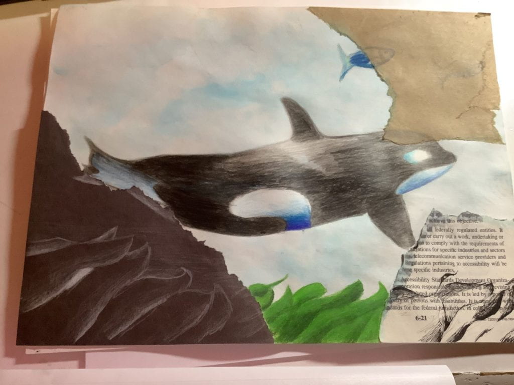
Orca 2/15/2022 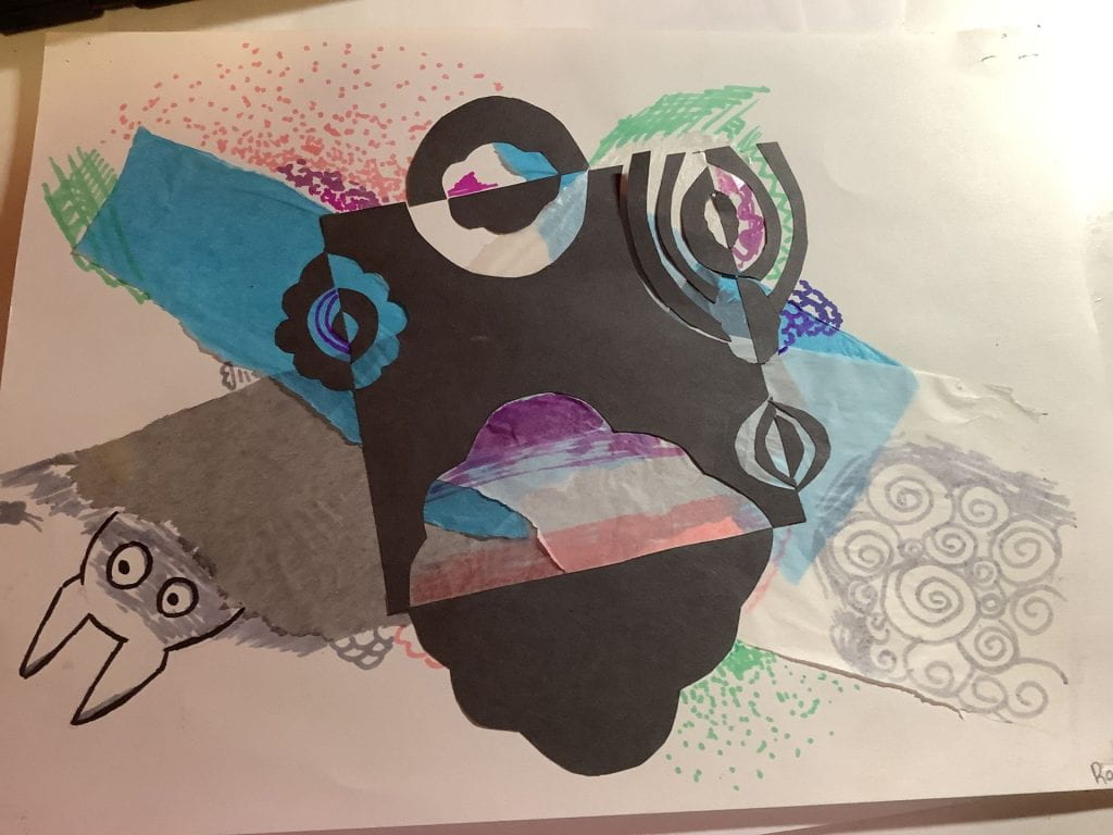
It was a shadow pattern thing. 2/22/2022 (Also, that’s a lot of 2s)
Started off nice and strong with some mix media. We had to do it in school and the resources were there, along with the surplus amount of time that they gave us. Enjoyable, lighthearted. Although for the orca one, I was pretty happy but my teacher kept making me change it. Kind of annoying.
More from March and April..? They’re stuck on my wall so I don’t know.

Dragone- April 2022 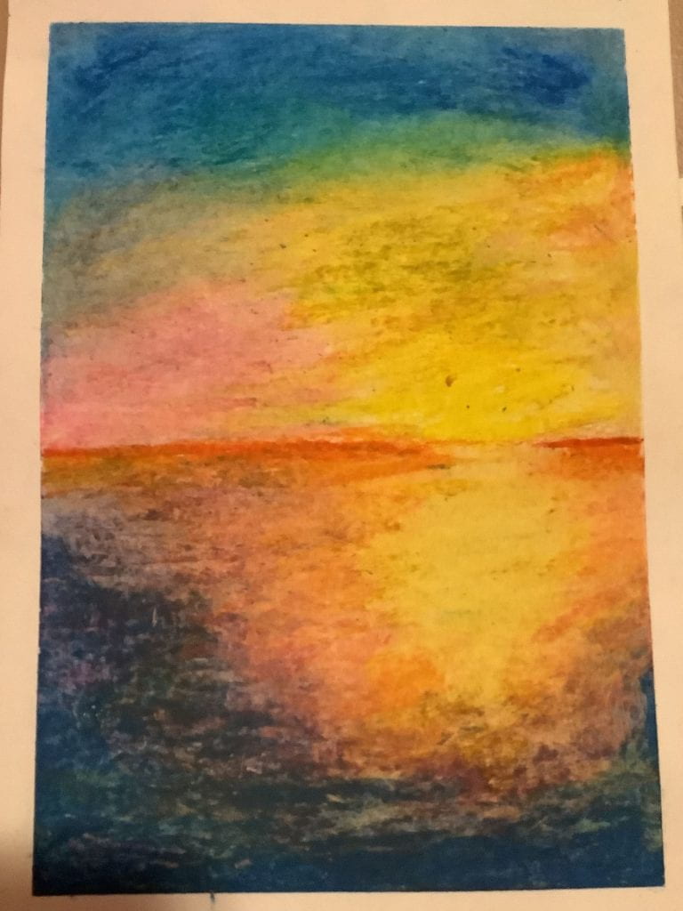
Sunset – April 2022 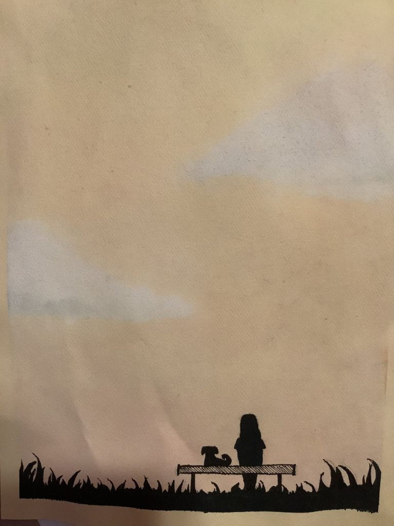
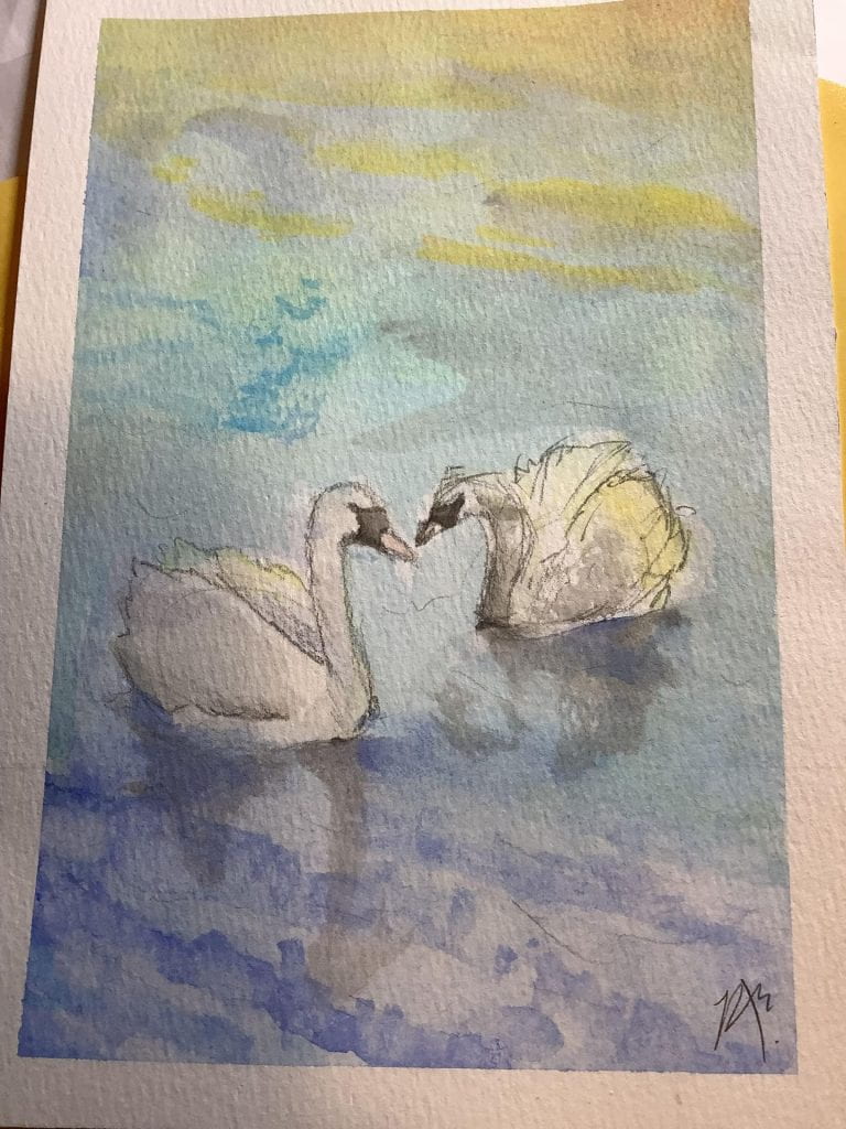
Sunrise – May 2022
I didn’t have high hopes for any of these. Since I was busy outside of school, these were all completed in class. Normally, teacher expectations are lower than mine. Sometimes my expectations even surpass my mother’s. Didn’t know that was possible.
The Sunset one was made with oil pastel. Normally, oil pastel is not my forte. I completed it in 1 hour. At the 40 minute mark, it was looking pretty hopeless, at least to me, so I was just thinking, “I’ll just finish it regardless of how it ends up.” Look at how that went! I really needed a viewer on the outside to help me see it through different lenses because when I was done, it still looked really bad to me. Of course my friends were really excited to see how it turned out and I also flipped out after I came back to see it posted on the wall.
The watercolour sunrise was an idea put forward by my former, former art teacher. Many people were going to create a dark background on yellow paper, which is a pain. She suggested that we could work with the colour of the paper and I took her advice. Honestly, the colours could have popped a lot more. I feel as though it’s really dim (probably because it is). But it gives a really mellow feel, which I love. The inking in the front was really nerve-racking as I didn’t want to ruin what was already there, but it ended out really well!
The Dragon one was a disaster. My original plan was to make layers of watercolour into a city, just like we were instructed. Except, I accidentally made one of the first few layers too dark and everything went downhill from there. When I thought that this project had failed, I saw a droplet of water on it and was immediately intrigued by it. Why didn’t I see it before? I don’t know. It seemed to had dried perfectly so it probably was on a lot earlier than when I found it. At first, I thought that it was another addition to the mess I made, but after that, I realized that it could become a lantern. After all, the city was known for it’s lanterns. Adding more droplets of water was bound to make it messy, and some of my friends thought it was a volcano exploding in the end. But that doesn’t bother me. I also added lining with ink to make it pop out more, since it was all over the place at that point. I added sea monsters, a dragon, and some clouds. Personally, I like the clouds the best. Was this what I expected? No. Did it turn out well? Perhaps. Do I think it has a lot of meaning, history, and symbolism behind it? Absolutely. I think it took a long way to get here and the process was painful but worth it. It was way out of my comfort zone but it somehow ended up perfectly. This was probably one of the best artworks in relation to the journey it took to get there.
There’s 2 more even weirder stories regarding artworks and their journeys, but maybe that’s a bit too out of my comfort zone to share with everyone.
Mid-2022
Not my usual medium

Birb – 8/6/2022 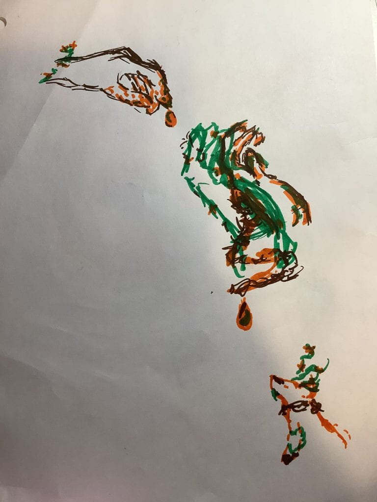
Drip… – April 2022 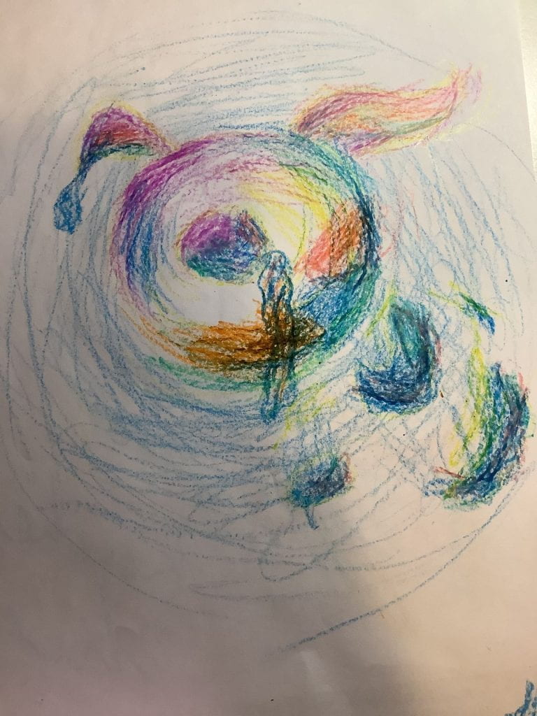
Seelie? – 8/5/2022
Pretty interesting, huh. I particularly like the ‘Drip’ one in the middle. I had to come up with it in a few minutes, since it was during an improv session, so my time was limited. I made another one called ‘Imagine Dying’, of which The Most Awesomest (Cello) Teacher I Have Ever Had (Please don’t send this to any other cello teachers) had promised to hang up on his wall. I liked ‘Imagine Dying’ better, but only by a bit.
The others were from after I went to the Heritage Festival and got this handy dandy crayon star thing with a lot of colours to choose from. I’m pretty sure I drew ‘Birb’ in the early morning when I was still half-asleep. Still like it though!
My Usual Medium (At the time)
Lapis_ – July 2022 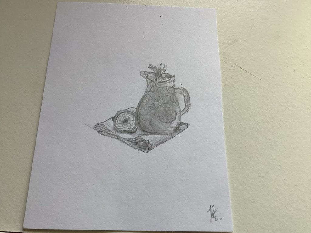
Lemonaid – June 2022 
Nami and Me – Old.
Honestly, July would’ve been great until something ruined it. I’ll spare you the details. Lapis_ was for my profile pic on some platforms, because I felt that it was kind of rude to take other people’s creations. Lemonaid was for a friend since I was leaving the school to come here. She reminded me of lemonade so I drew it. I named it Lemonaid also because she needed aid. As in drama-related. Yeah.
Late 2022
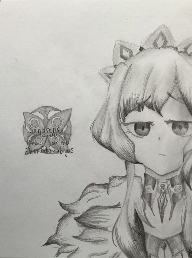
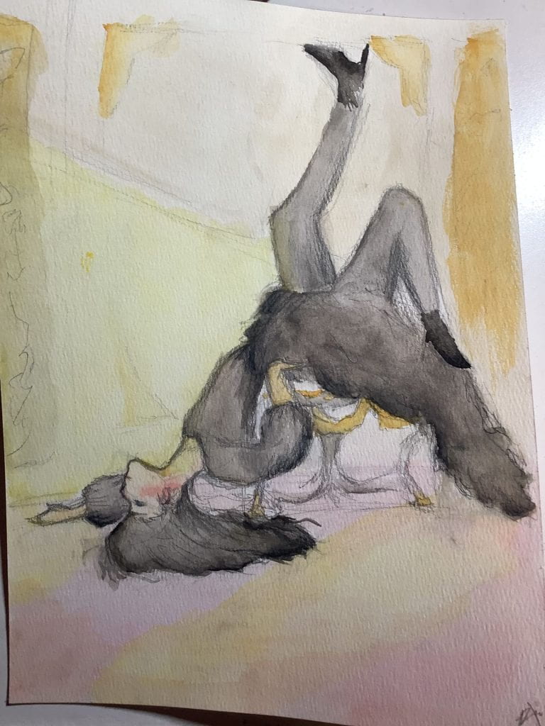
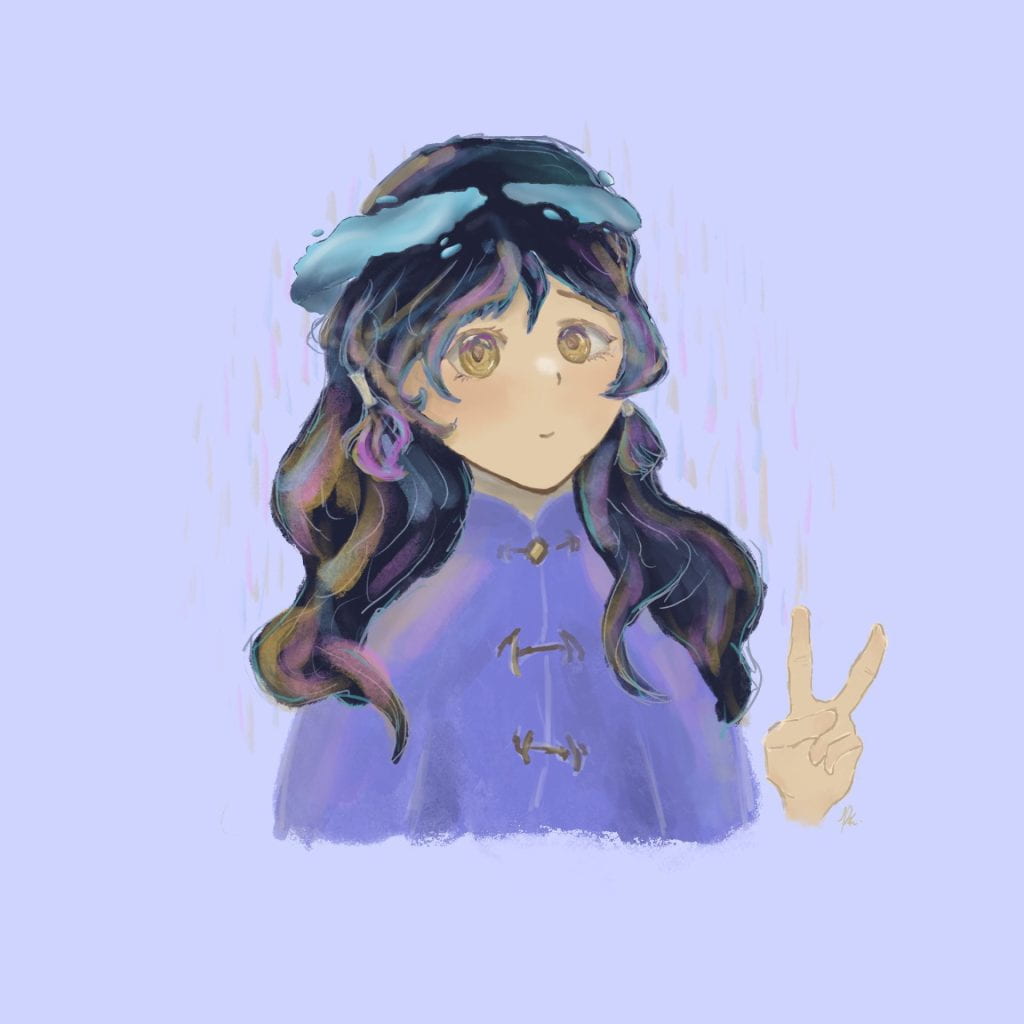
Sandrone – August 2022 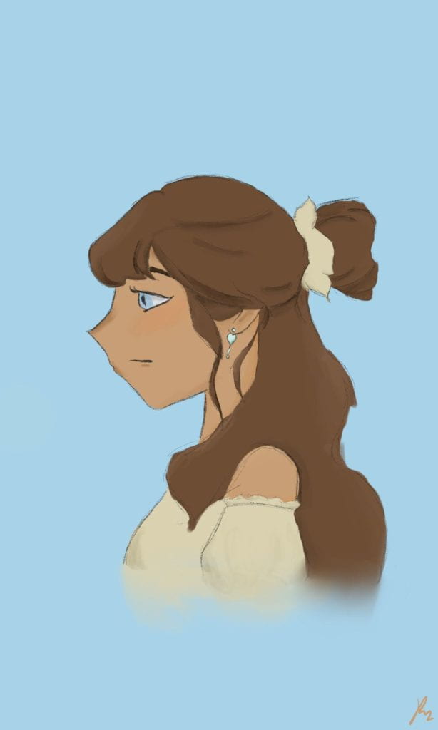
Side Profile – August 2022 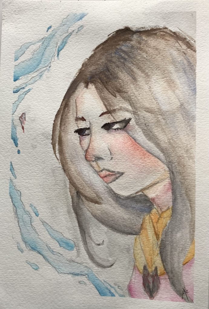
Linh 8/31/2022
There’s nothing much. I kind of lost motivation over term 1, but believe me, I’m trying to get that back! And make it even better! Also because I started making Genius Hours so I’ve already shared with you a lot of cool stuff! I like Linh the best, she’s awesome. I’m surprised that I could make such a good piece with some bad brushes. Though, there are some issues with the nose and mouth. They seem really 2D.
Some beginnings of my new style… (More elaboration later!)
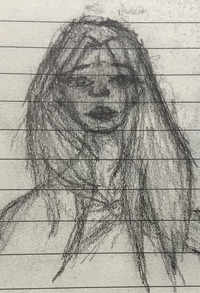
Beware! Viewer discretion advised! Risk of absolute disgust! (I understand!)
I haven’t shown you the first few attempts of my new style, yet! Don’t be too excited, it’s absolutely hideous (for my liking).
Don’t worry though, if you are able to survive through this portion of the article, there’s much better drawings that don’t make your eyes sore soon! More description of this new style can be found underneath this monstrosity.
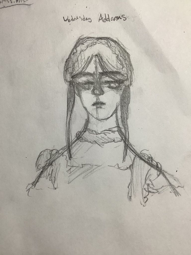
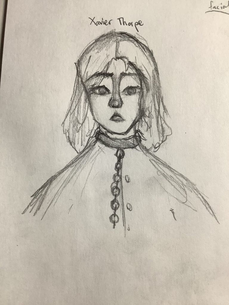
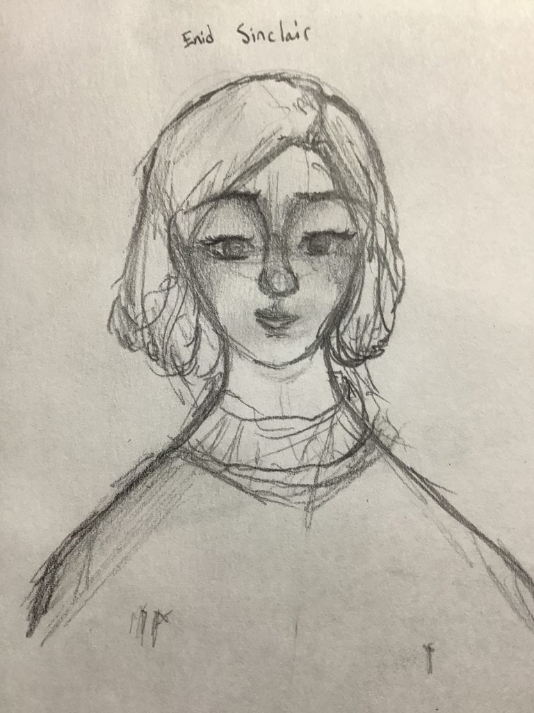
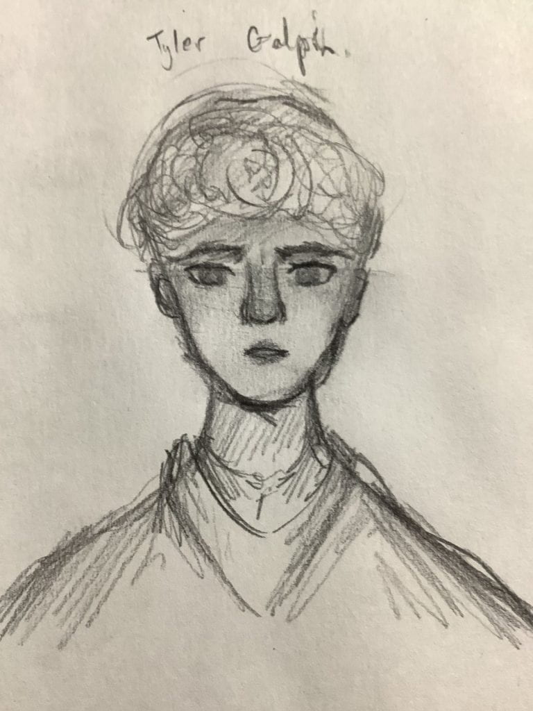
1 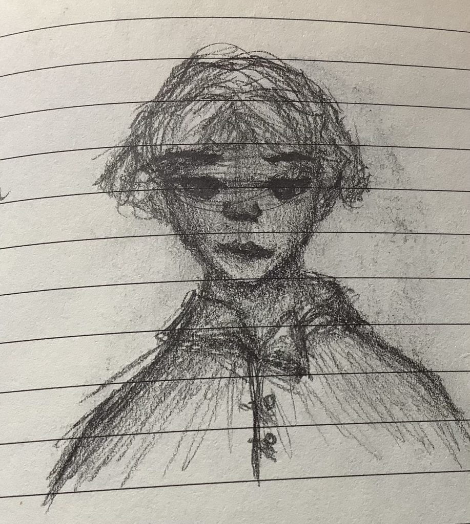
2 
3 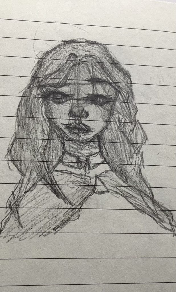
4
- She looks like a caveman. Or should I say cavewoman. Not only is her eyes way too big, but her mouth is too! Her eyes are just creepy.
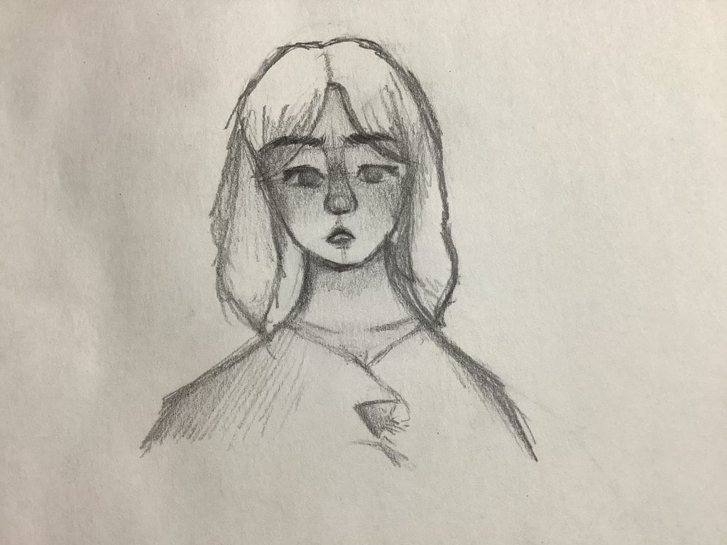
- His was pretty okay. The shading was great, but the frame of the face could’ve been bigger, in relation to the eyes. His hair was a challenge, but I added so much shading that it actually looked okay!
- Her eyes and mouth too… A bit too much. The eyebrows were starting to take shape, but her face frame was too child-ish, which resulted in her looking like a 10 year old. Her braids were a bit poofy for what I had imagined, but that’s okay.
- Now this one was actually getting somewhere! She had a definite expression, her jaw was clearly defined, but her hair still had that cartoon-y element. Her lips and eyes are still too large, but overall, it looks pretty well-done!
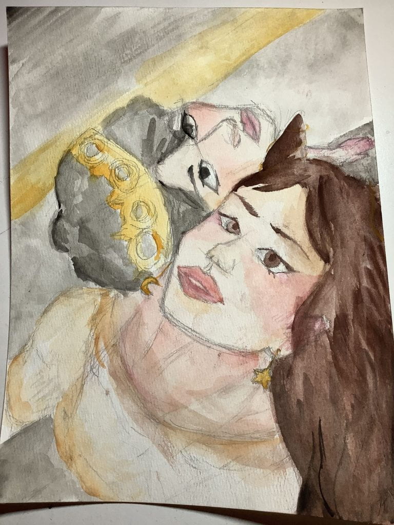
Comparison through Styles
Recently, I drew an awesome piece of a character that I’ve also drawn over summer break. She’s my most favourite character – nothing can top that. Out of curiosity, I decided to pull out both drawings to cit!ompare. Let me tell you, never have I ever been so shocked at what came out! I hadn’t even noticed my improvement. I 100% like my new style better, but it’s up to you to decide. (Also no hate on my old style please, I KNOW it’s cringe, and I do agree that it does look really bad.)
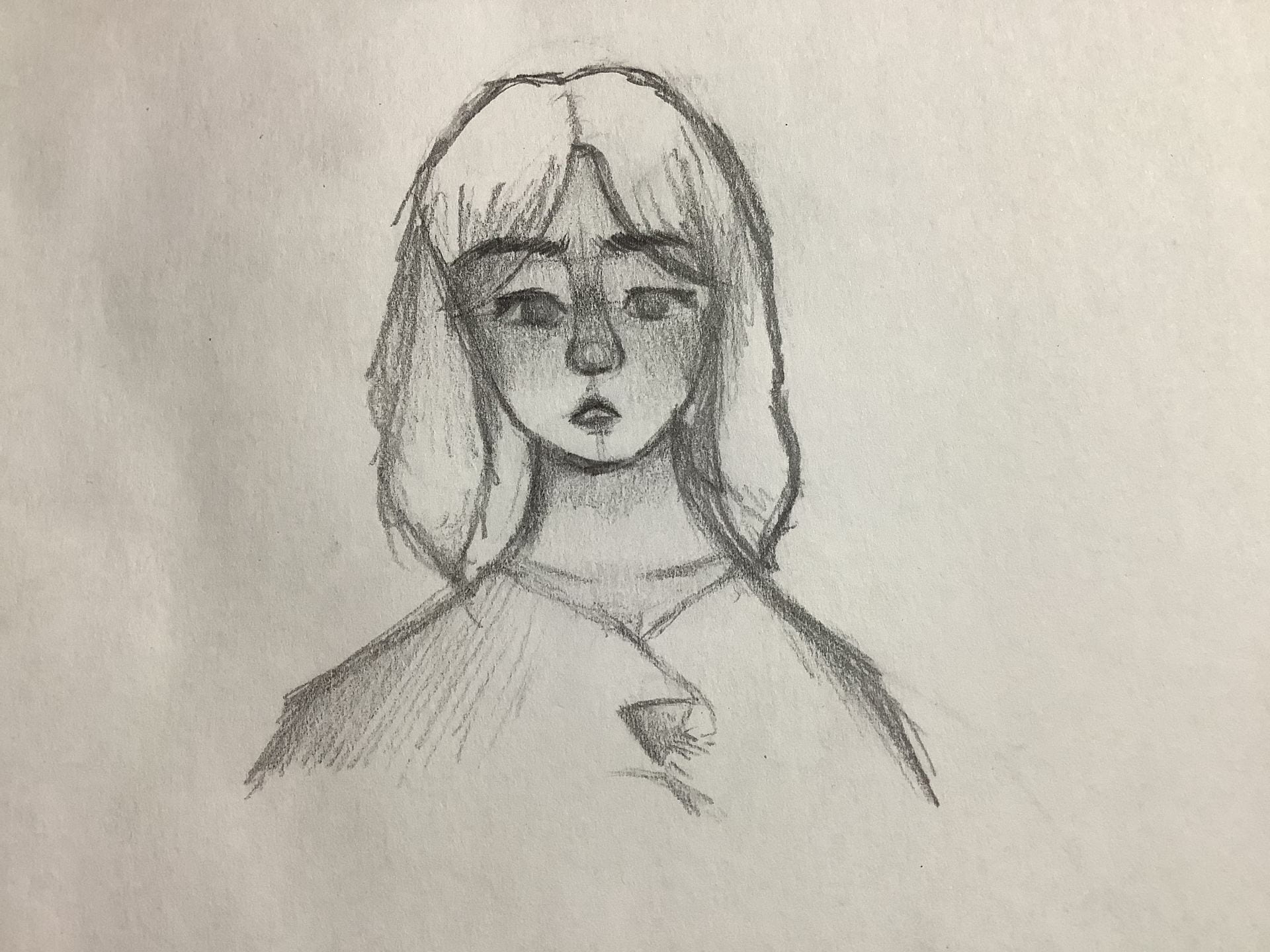
New style obtained in October 2022 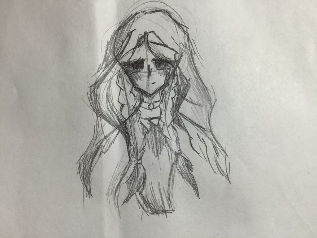
Old style obtained in July 2020
I KNOW. LOOK AT THE DIFFERENCE. And yes, same person. Maybe different hairstyles, but that’s it.
Let this be a moment that I’m actually proud of myself before I get back to high standards.
Honestly though, look at how far I’ve come!
Before, I used to draw lines as mouths and a lot of it was based on cartoon-y styles. I liked how the hair was very flow-y. It doesn’t follow the rules of gravity. The eyes, however, are extremely overdone. There were a few months where I was so annoyed at the eyes. Why were they so hard to get right?? A lot of it were just lines and minimal shading, the one I’m showing you were one of the only ones with a bit of shading. It really matched the style though, so I’m happy with my old art style. Being able to draw cartoons and semi-realistic is great! That way, there are a lot of different techniques in your inventory.
Fun fact, I actually discovered my newer style on a road trip to British Columbia! I was getting pretty bored of the old style and at school, we had to create a drawing with the accurate proportions to the human face. At first, it was hard to get right. Usually, the eyes were too on the side of the head and the mouth was too low. I was aiming for a completely realistic style, but I settled for semi-realistic. Oftentimes, my sketching is too quick, so I don’t spend enough time on it. That’s maybe why I am not suited for a complete realistic style, but this one’s close! I like this style because it’s very simple. Nothing too messy, just a face. Nothing too eye-catching. It just blends into the background. While drawing, I also noticed some things that I do in my art, that I haven’t seen people do online: I connect the bridge of the nose to the eyebrows. I’ve been told to not do that, but after a sketch with it accidentally, I found to love how natural the lines looked with the nose bridge being drawn in. So, I did what any artist would do. I added it in! After two months of trying to adjust to it, I’m pretty sure I got the hang of it!
That’s it… See you next year!
After all of that, I am very pleased with my progress and development this year! I was mostly motivated towards the end and I have discovered new ways to create and express art. Creating blogs definitely isn’t my thing, but I’ll spend some time on it, if I have the time. From when I’m writing this, we have 2 days left of 2022. I hope 2023 won’t be as disastrous as the previous! See you on the other side!