Current Artworks
Some of my current artworks include:
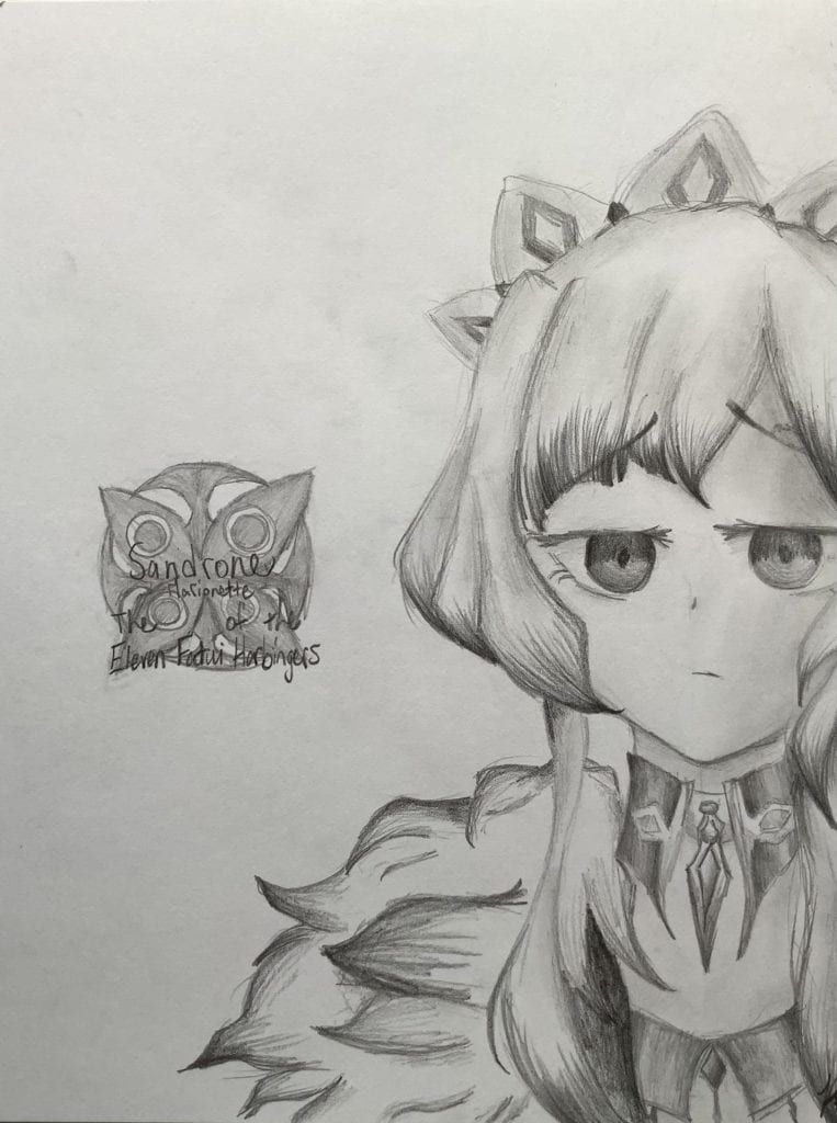
July 2022 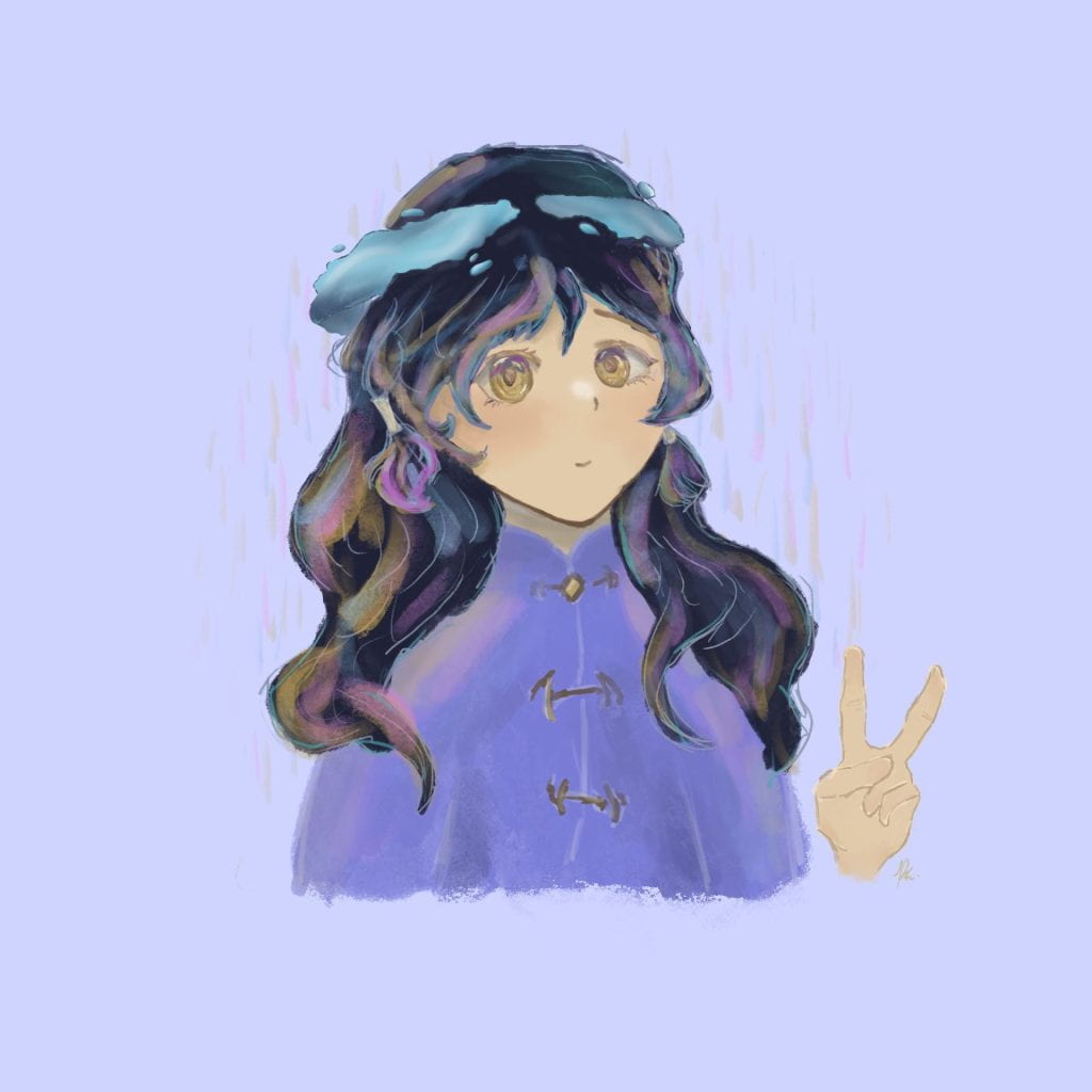
June 2022 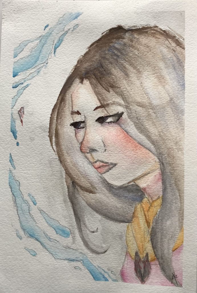
Aug 2022
Some unfinished works include:
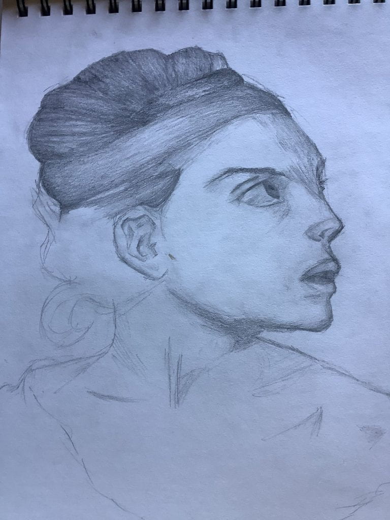
June 2022 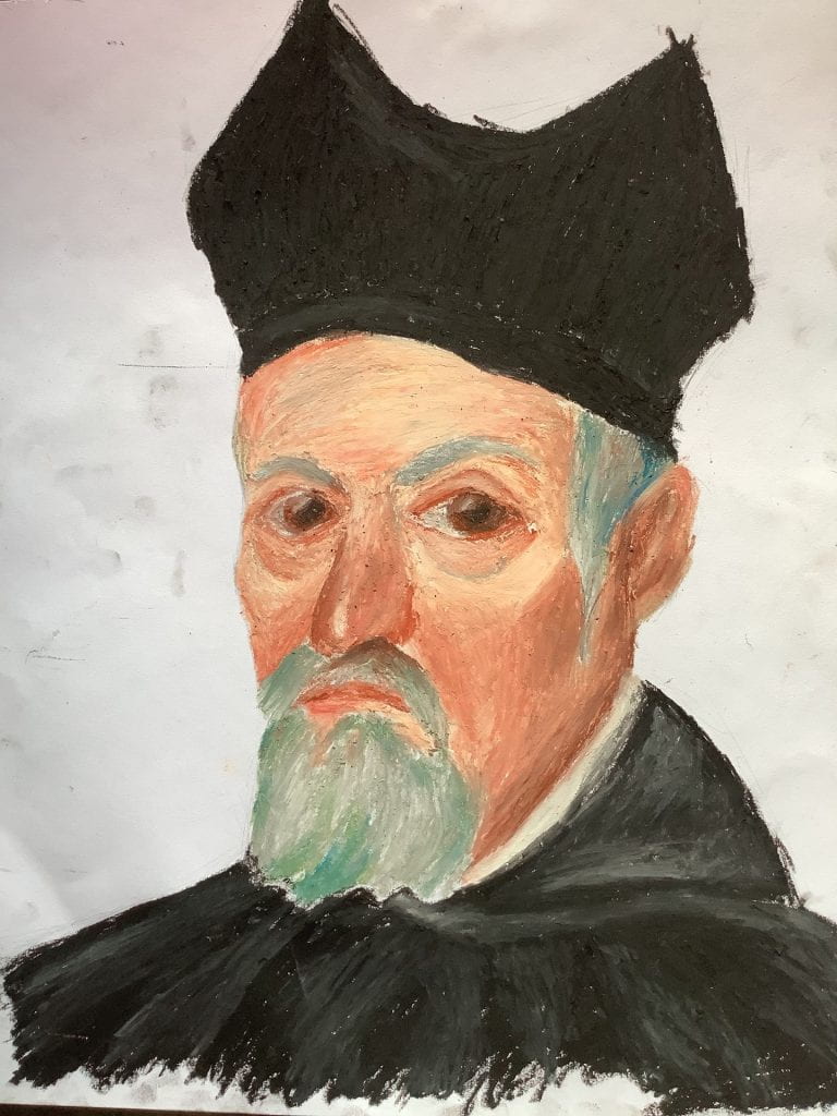
May 2022 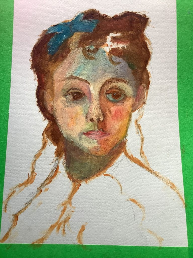
June 2022
Some failed/not-so-good works include:
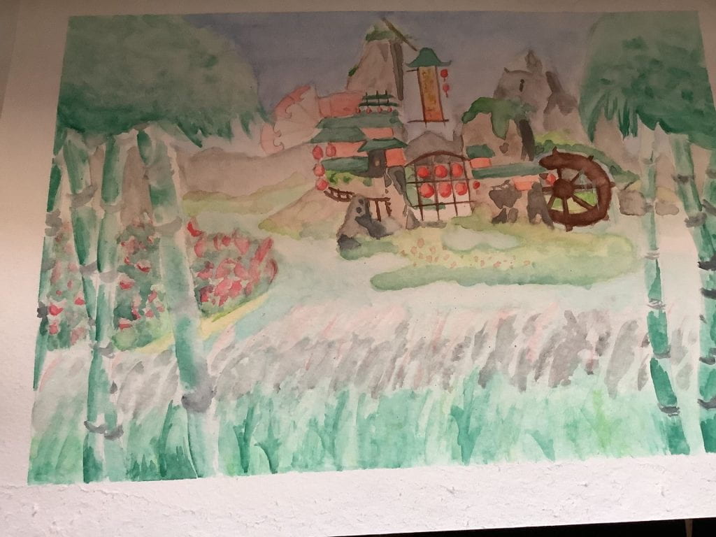
May 2022 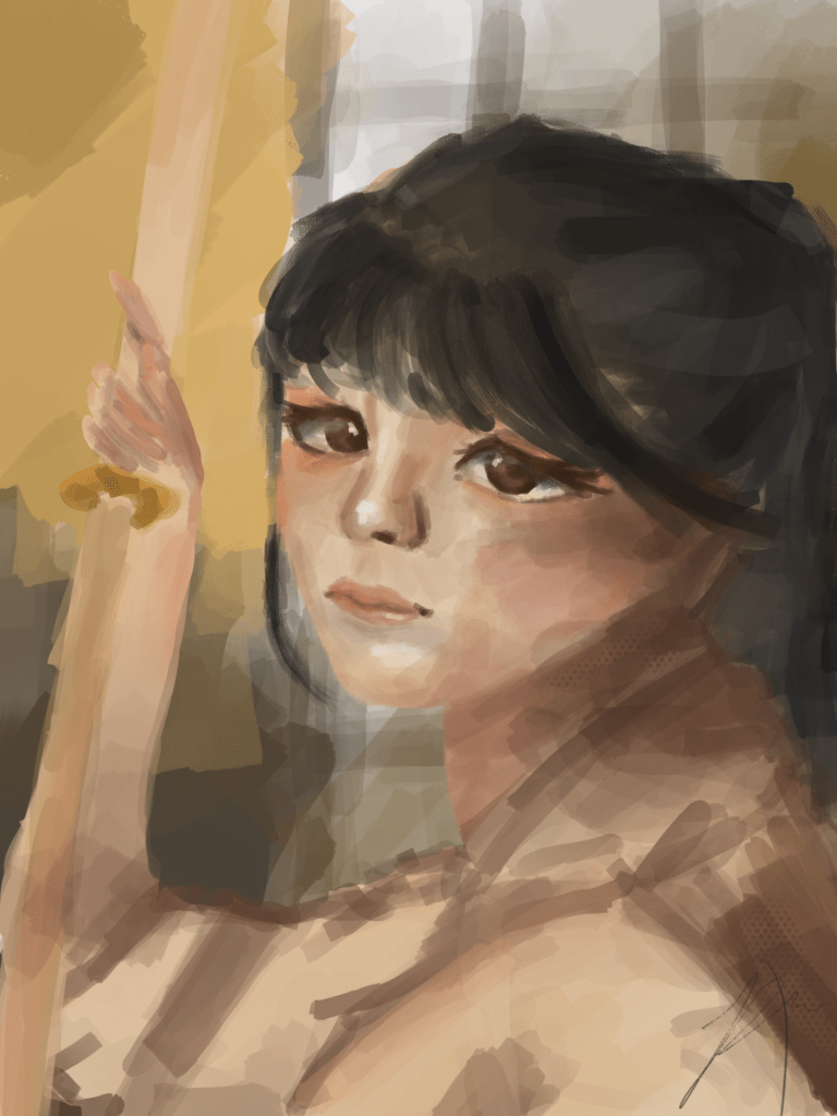
Oct 2022 – Got ahead of myself, I’m cringing now 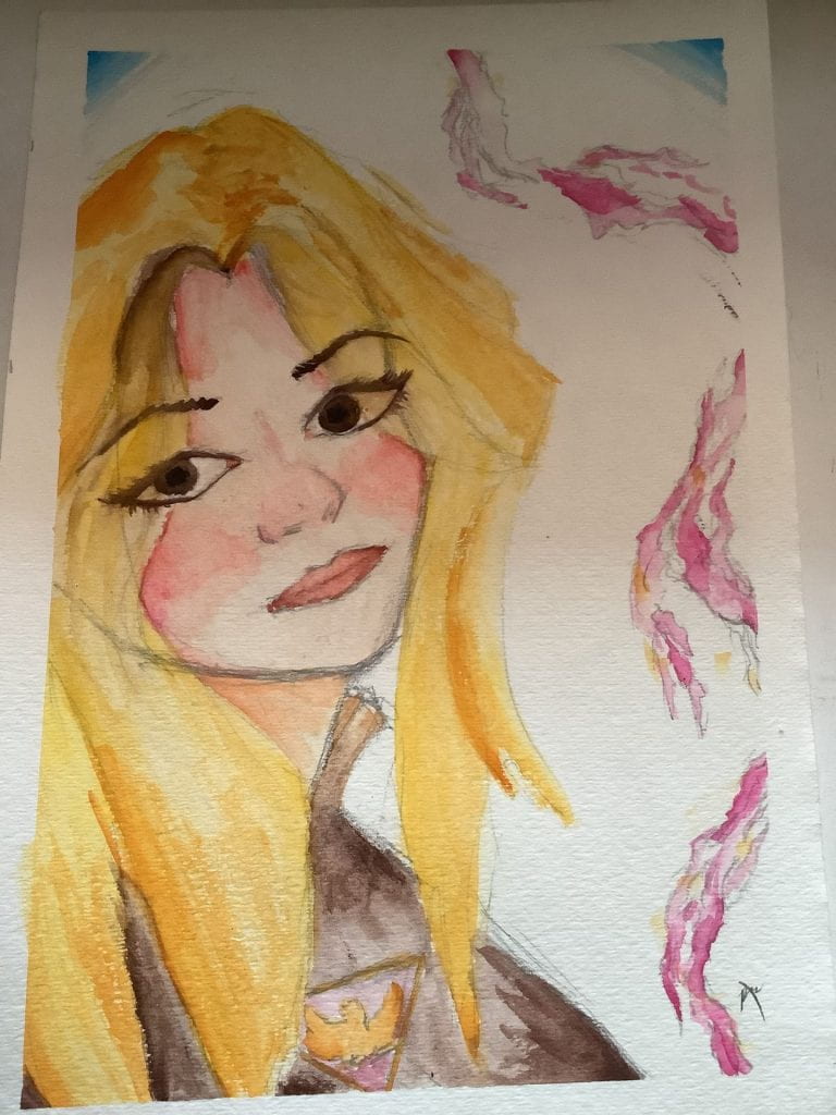
Aug 2022
Starting a New Piece
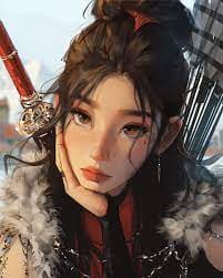
Time to go on Pinterest to find a reference photo! Here’s the one I chose:

I will only use a zoomed in version of the face for this artwork – better to focus on faces for now.
Which Style will I try to use?
I will try to use SamDoesArt’s style this week, which will definitely fail miserably, but that is beyond the point.
The Process
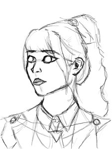
I have observed that SamDoesArt has a very organic way of drawing. He uses a minimal amount of colours and uses very natural shapes.
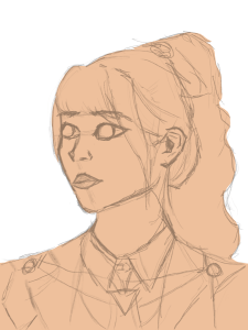
In some of his education videos, he first applies a base colour to the portrait. Then he alpha locks it, which is basically making you only be able to colour the coloured part, not the background.
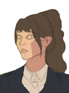
Then he recommends to add some warm and cold colours to be able to make the lighting existent. I decided to also add the other colours. We will see if it helps in the end.
Final Product and Thoughts
The final product is now out! I personally think this artwork really improved my skills compared to the last one. I really gave a lot of thought into it! Although, I can see some mistakes that are extremely clear. I will learn to change it next artwork.
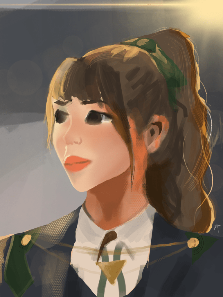
Along with all the cool features Procreate offers, there is an option of a speed through of the whole process! Throughout the video, you can see me fiddling with a lot of different brushes and techniques, especially near the end.
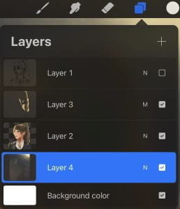
I used 4 layers for this piece. Sketch, Rendering, Multiply, and Background.
As a reference photo from SamDoesArt to mimic his style, I chose this one:
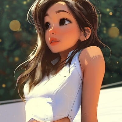
Compared to mines, you can see that his has more dimension and more contrasting. Mines is more bland and 2D. Next time I can work on that more. My favourite part of my art is probably the lighting effects that I used. It was out of my usual comfort zone, but it gave a bit of dimension to my piece and made me love it!
Areas for Improvement
Some improvement areas that I can clearly see are the right eye (left side for viewer) and the mouth. The mouth looks pretty nice when zoomed out with the whole piece, but it’s way too 2D and it is definitely not in the right shape for a 3/4 view. The eye was pretty good, but some blemishes have appeared over it and it now looks kinda blurred, which isn’t the best. I would rate this experience an 8/10.
Be First to Comment