This week, I decided to choose a more pose-based artwork. I decided to use Alessandra from The Shadows Between Us as an example. I figured that if I could be able to relate to the character I was drawing, I could make it better. I don’t think it worked well, but I’m hyped for next week as I have an awesome idea to do over the winter break!
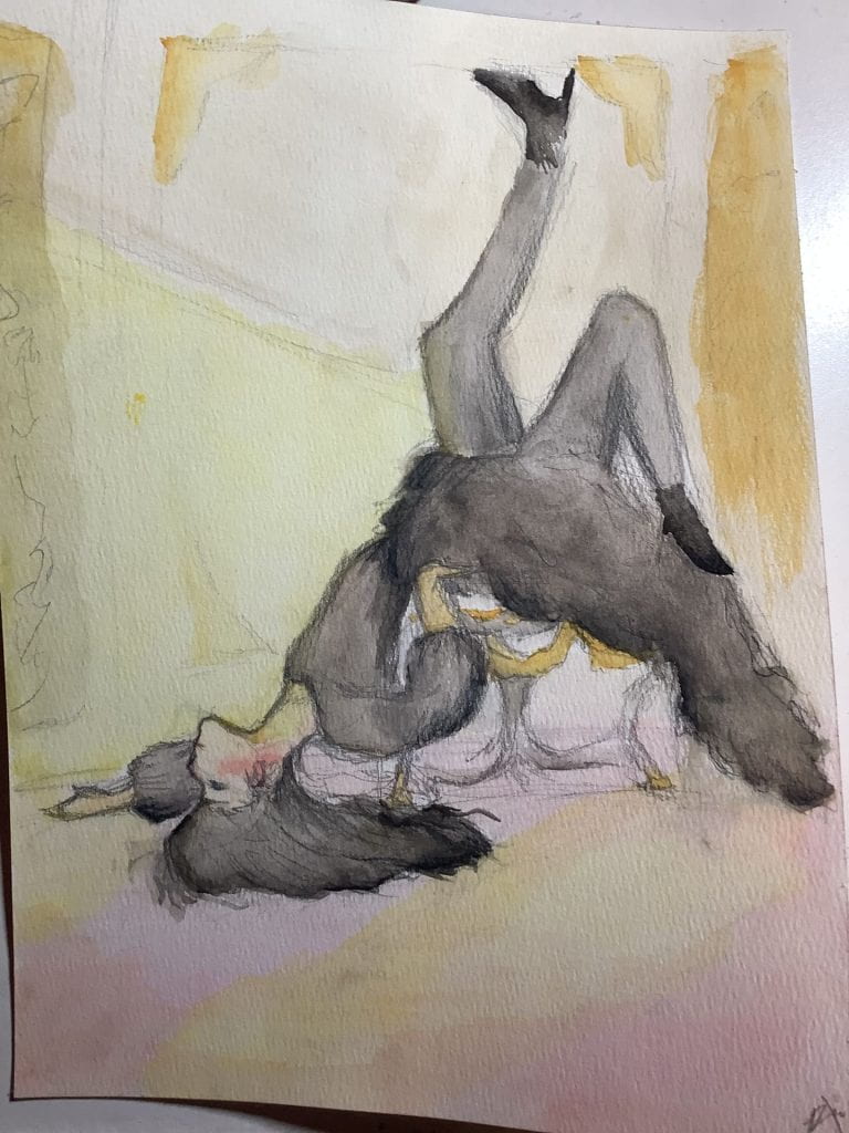
Here it is. Looking back, I’m surprised I actually could tell that this idea was not working. Usually, it looks absolutely amazing when I am done the artwork, but when I come back the next day, it’s really bad. Honestly, I liked how the face and surrounding areas turned out, but overall, it is definitely not my favourite. Before I get into the details, Let me show you the reference photos.
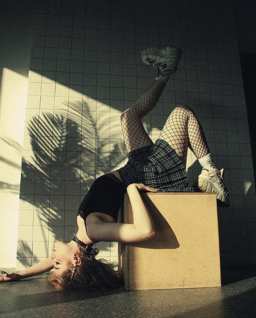
Pose 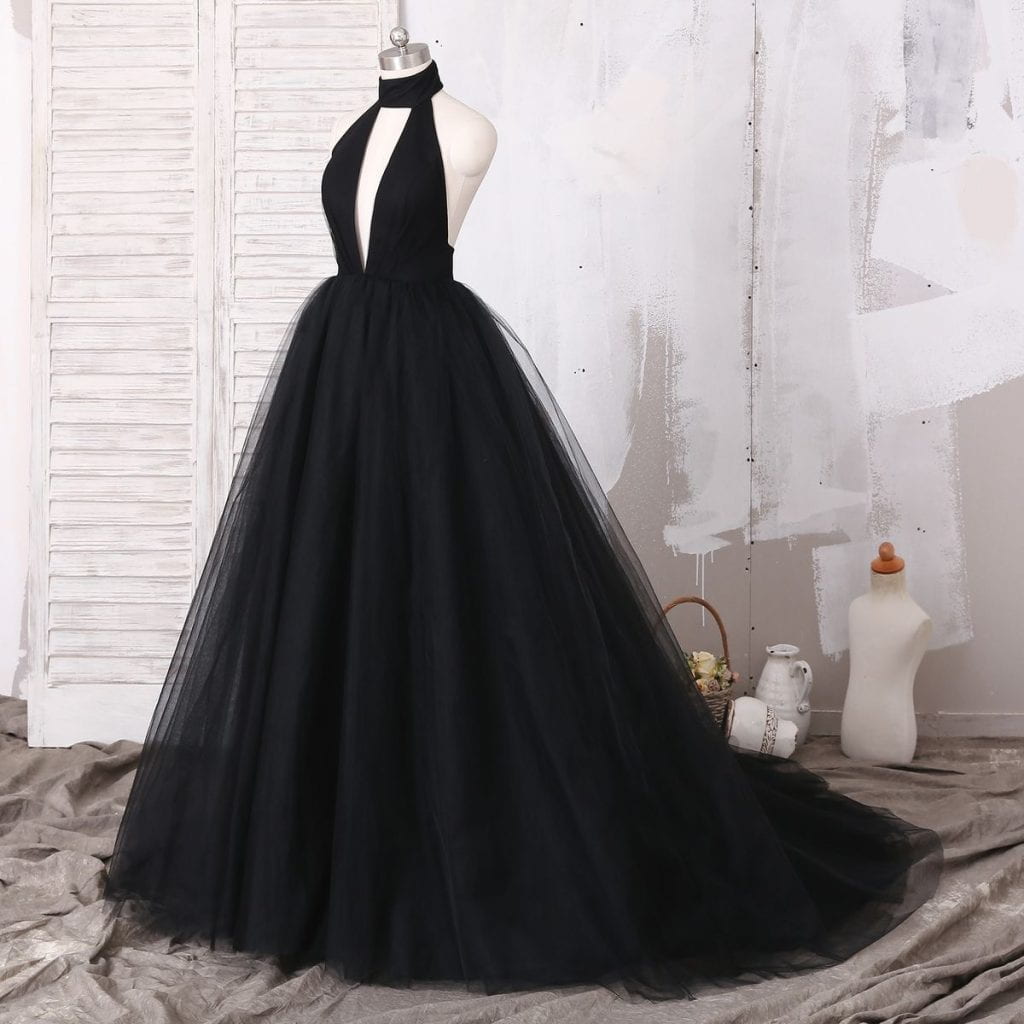
Clothing 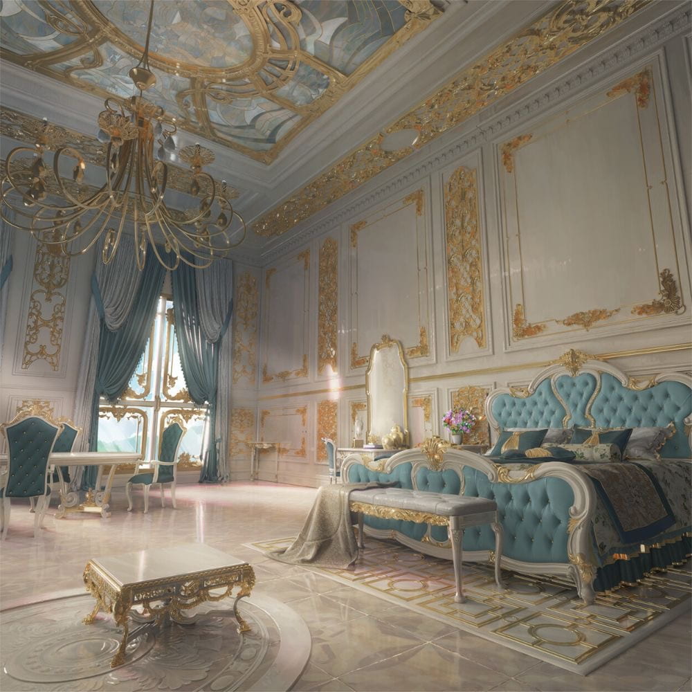
Background 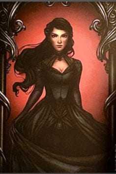
Character 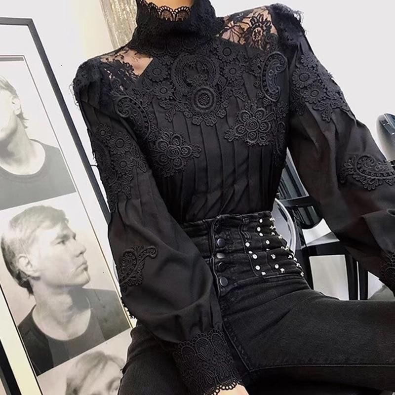
Clothing 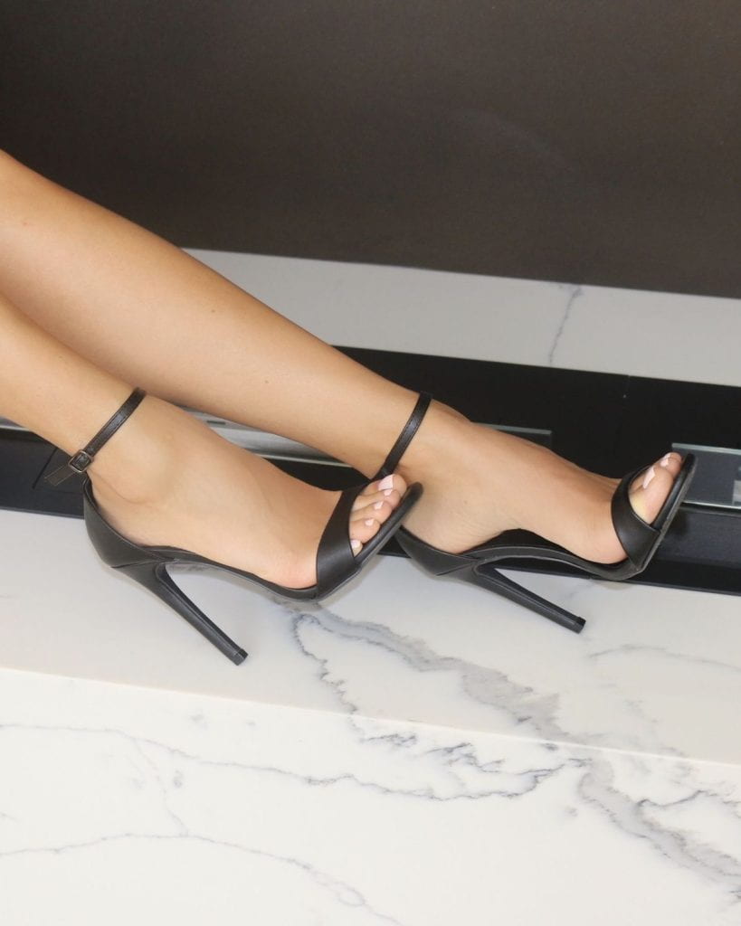
Heels
Yes, it is a lot. I want to test my abilities to be able to merge multiple photos into one painting. I try not to completely copy a picture 1-on-1 as I am becoming more of an intermediate artist. Obviously, I need some work with that.
If you’re a beginner, I highly recommend tracing or “copying” an artwork. Not only will your knowledge on the fundamental proportions become better, but it is a great way to ease into art. I did it too!
As you can see, the pose I chose is a very “rare” pose, it isn’t usually used very often. Maybe I can resort back to more natural poses as I am still very beginner at poses.
Problems (I have many)
Some problems I encountered were hair, fabric, lighting, and background. There are much more smaller details, but I can cover that another time.
The hair was a difficulty as I could not get it to look natural. In the reference photo, the subject has curly-ish hair, which doesn’t match my desired style. Looking back, I would have assumed the hair to be more a circle on the ground unless she has dragged it on the ground for a long time. That is because hair falling straight down will not necessarily bend to gravity and somehow line up and looked like it has been in a sweeping motion.
The clothing and fabric was a great difficulty and it definitely has not worked better now. I tried to take the fluffiness of the dress into mind, but it still looks very “forced” and fake. I also didn’t do a good job on the waistline. I’m pretty sure it doesn’t reach so low. The sleeves are also supposed to be very “open” and fluffy, but it looks so rigid. Some ways to solve this may be to add a layer of the background colour before I elaborate the clothing in detail, so some parts may look more translucent. The leggings that she wears looks too watered-down so next time I may want to make it more solid and more of a statement.
The background could use much more improvement. I realized that the atmosphere should be more heavy, as she is in all-black and it would be more appropriate to add a darker shade of colour to the background to match the vibe. This was after I decided to make the flooring pink. You can see a light darker red layer overtop, but it’s extremely watered-down. The walls actually look pretty nice, excluding the lighting, which we’ll get to later. The chair that she’s sitting on has some perspective issues. I made it exactly from a side profile, but closer look at the reference shows that it’s actually on a slight angle, though it still looks pretty good.
The lighting is an issue. In the reference photo, it was a lighter yellow, but it didn’t show on the paper so I had to make it more darker. The issue with that is that the light is darker than the walls, making it seem as though it is part of the background. I could have made the lighting more definite, as they kind of blended out, which doesn’t work as light usually makes definite shadows. However, I like how the light hits the subject, as it makes her skin looks more alive and in the picture. Next time, I will try to make the lighting look more natural, and maybe add the lighting layer on the first few layers so it is not extremely apparent in the final artwork.
Overall, I would rate this experience a 4/10. Definitely a lot to learn, but there are some things I like, such as the jawline and the eyes. Definitely a lot to work on! Be sure to come back next week to hear me pitch my “awesome” idea!
Be First to Comment