Before you leave, please hear me out. Maybe I am very ambitious (no I’m not), but I want to try a lot of things, plus, writing is so easy regarding the materials. All you need is a computer and maybe a piece of paper and pencils to jot down notes. I have 1 hour to spare at school every week, might as well put it to good use.
What do I plan to accomplish after this?
I plan to write a book fully, As in I won’t quit and give up in the middle. If I dream far enough, I want to publish it. It should be pretty easy with today’s technology. I certainly am not expecting it to blow up.
My weaknesses
I am a very spontaneous person. One day I might want to draw, the next day create a journal. I have shown earlier how this trait is not a very good aid in Genius Hour. I cannot keep working on the same thing for 6 months! It is humanly not possible. This is the same with my projects. I can’t wait for forever to to continue a project, so I must try to somehow be able to achieve that.
Goals
I plan to be able to bring out that creative side of me, without having to wait. Usually that inspiration comes at a time when I am unable to bring it out onto paper or type it out onto computer. That’s a lot of good opportunities wasted. I hope to be able to somehow harness that side of me throughout ALL of these Genius Hours, so then I will be able to work better in the future.
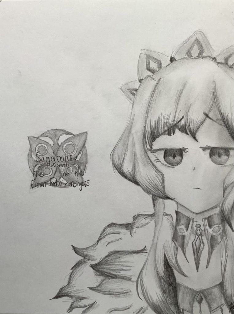
I’m bored, okay? It’s only Week 5 and I’m already dying over here. I’m sorry, I just don’t have the inspiration right now. Until a few days ago when I thought it was a good idea to draw characters from books. I don’t know where it came from, but here we go! Our first victims are Jude and Cardan, from the Folk of the Air Trilogy (would highly recommend, 10/10).
Reference
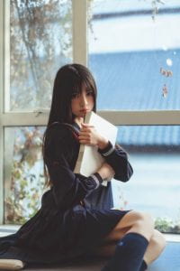
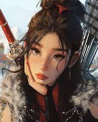
This week I used 2 reference photos. One of the perspective, one of Jude and Cardan (depicted by JessDraws).
Jude and Cardan
Perspective Photo
The Process
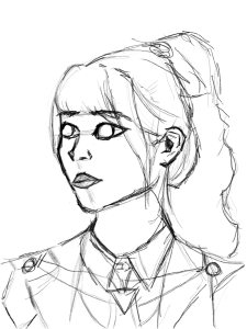
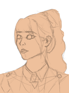
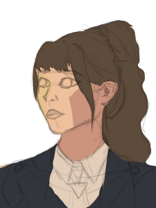
This time, I made sure to videotape the whole process! It took about 1 and a half hours to complete, but the setup time took 30+ mins for me to get the right angle of the camera. Even then, it still wasn’t good since it was at a slight angle, which messes up the viewpoint. It also took me 30 mins to get into the ease of drawing with cameras rolling. I was very tense for the most part up until the end, when I finally relaxed.
SPOILER ALERT: DO NOT READ THE NEXT PARAGRAPH IF YOU PLAN TO READ/ARE READING THE TRILOGY.
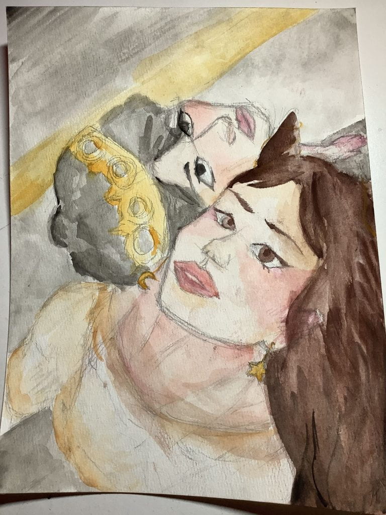
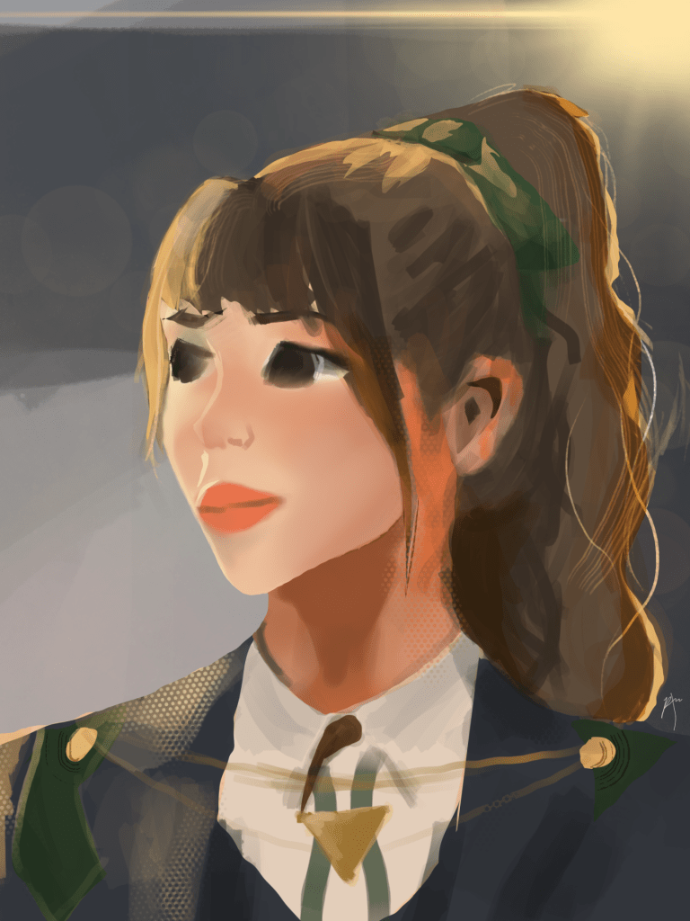
Some things I love about the artwork are some of the details. I really like mini easter eggs, since it feels so good to be able to see it. Compared to other artworks I’ve made, this artwork contains very little easter eggs, but more than my previous artworks in Genius Hour since I am drawing something I like this time. I like the parking lot depiction in the background, as Cardan does go to a parking lot in the last book. He seems to respect a lot of the mortal culture even after him being especially rude to Jude. (It’s a enemies to lovers trope). I like Cardan’s crown, it’s always cute. Also, it’s in the cover of every book of the trilogy, which means it’s pretty important (hint hint). Jude is always very cute with her lil’ horns and I love the way she’s looking in the artwork. I also added a little star and moon earrings, the one Locke steals from her. Honestly, I love it so much.
Jude Duarte and Cardan Greenbriar
Here’s the video I promised you! It’s really sped up. Also, do you see the part when I wrap my water cup with paper towels? Yeah, I punctured a hole into the bottom of the cup. Also yes, I don’t know how that happened.
Final Thoughts
Overall, this was a really great project. It took way less time to draw than the last project. I’m happy with a 2 hour artwork of this. I think the lighting doesn’t match the reference, but that it also has it’s own part in it. I love the way I did their shading, it really is wonderful. Or maybe I’m becoming delusional because I’m writing this at night. I am quite surprised by how quickly this was finished, I was prepared for doing it in two days, as I was sure I wouldn’t finish it. Some things I would change would be the lighting, and maybe the background. The background should be more in the background, but this one looks sorta with the artwork. I don’t know if that’s good or not. I also see Jude’s right eye (our left) is very pale. I didn’t intend for it to be very colourless and will pay attention to make both eyes the same colour. There is also an issue with how Jude is positioned. I think that she looks sorta weird with the pants being gray and the shirt being beige. It looks cut out a bit and I don’t know what happened. I will try to make clothing look more natural in the future. Next time, I will actually use a good quality water cup, so it doesn’t leak everywhere while I’m painting. I also think that I will use a different pose, as it is clear that I do not have much trouble with this one. Onto the next victims from other book series!
Even though my original plan was digital art, I feel as though I can also improve with watercolour. I find my main problem right now is dimensions. Digital art is so different from traditional, but the dimensions are the same. As long as you have good dimensions in a drawing, if intended, then it will be very lovely to look at. Having bad dimensions makes a drawing look “weird” and “off”. I mostly want to use watercolour because it’s more fun in my opinion. I believe that I need to use the best of my time. Personally, I’m not too keen on staring at a screen for 3+ hours and creating a semi-masterpiece.
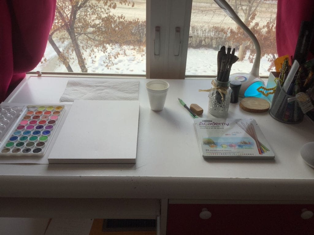
(New) Materials!
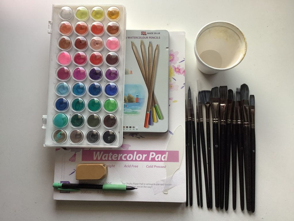
Another reason why I chose to do watercolour is that I have SO MANY supplies that are sitting around. I love watercolour, so that’s probably why.
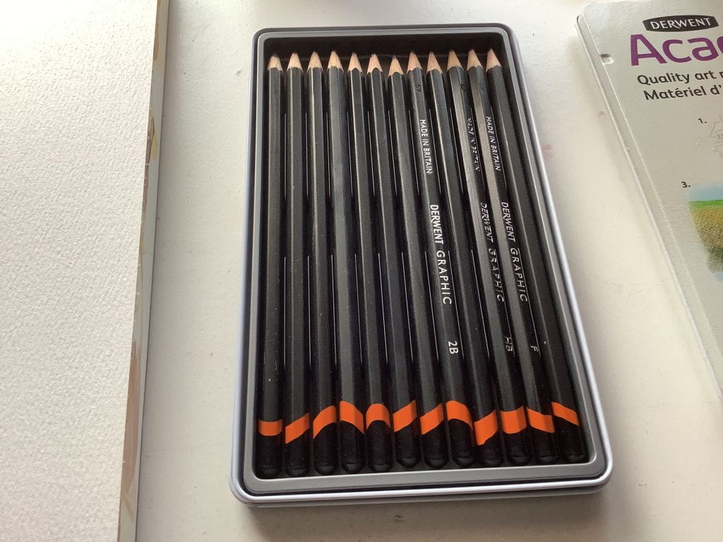
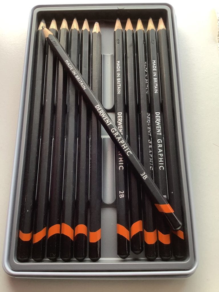
Derwent Graphic 9B-H
Overall Watercolour Supplies
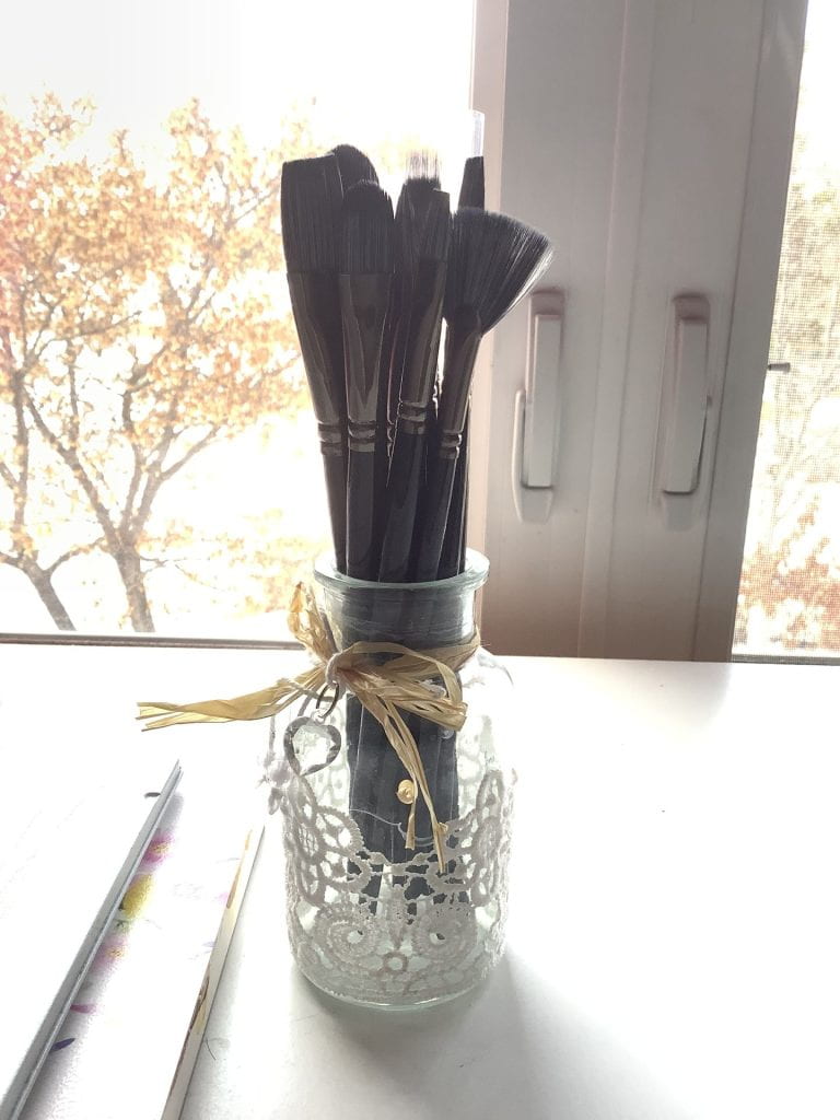
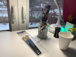
New Brushes!
Workspace (Missing: Derwent pencils)
Out of them all, I am most excited for the new brushes, as they came in just a few days earlier!
What about the older brushes?
Some of the reasons why I chose to buy new brushes was because the old ones didn’t hold any water. I don’t blame them, as they are meant to be used for all-purpose. I do beg to differ at the “quality brush set label”. It’s not quality at all, the hairs fall out, and there is only 7 of them, of which half of them are damaging the paper. Would not recommend.
Old brushes (left) and new brushes (right)
The new brushes were actually extremely cheap compared to the quantity and quality of the older brushes. There were many different types of brushes, and each of them came individually packaged. Not only that, but the hair on the brushes NEVER FELL OUT. I’m pretty surprised that it has exceeded my expectations. Also, aren’t they so cute in that lil’ glass bottle?
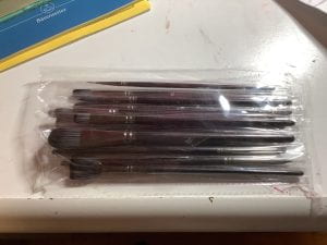
New brushes when arrived (individually packaged)
Reference
Reference
Reference 2
Overall Process
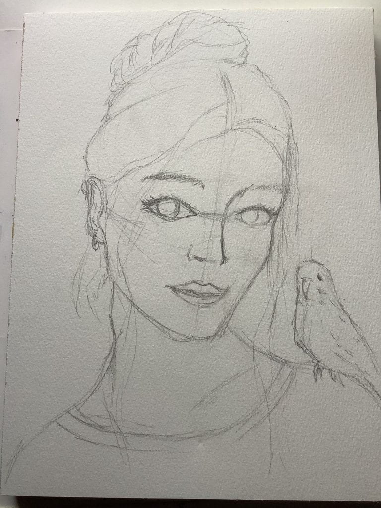
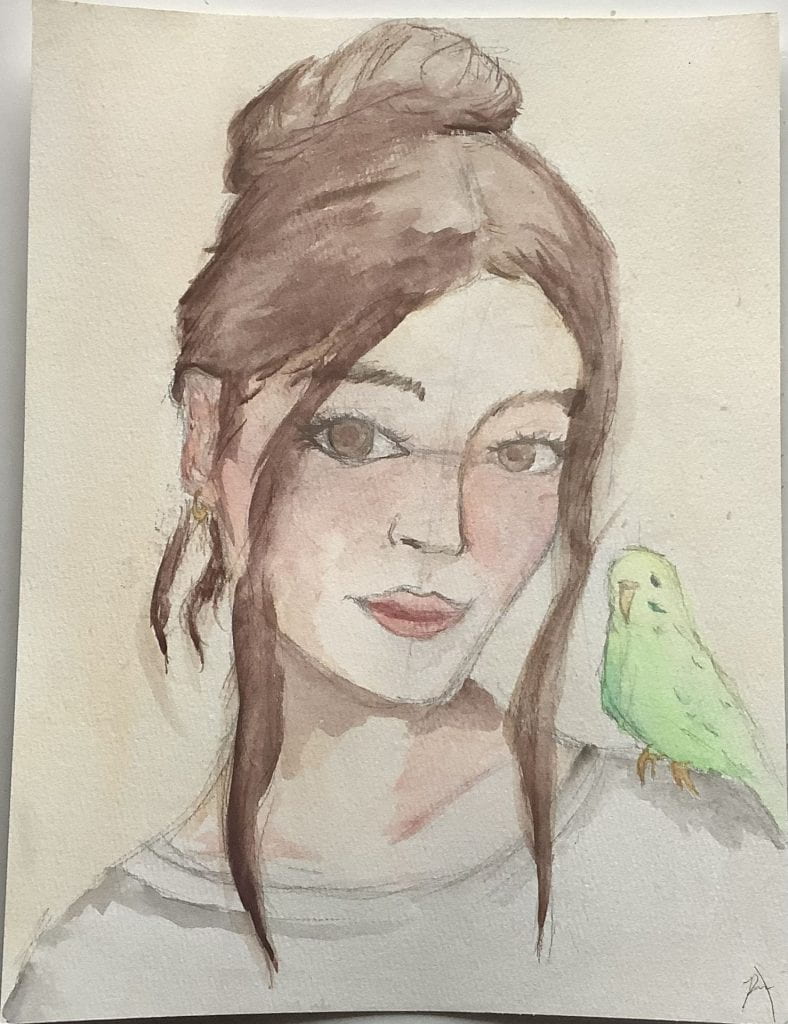
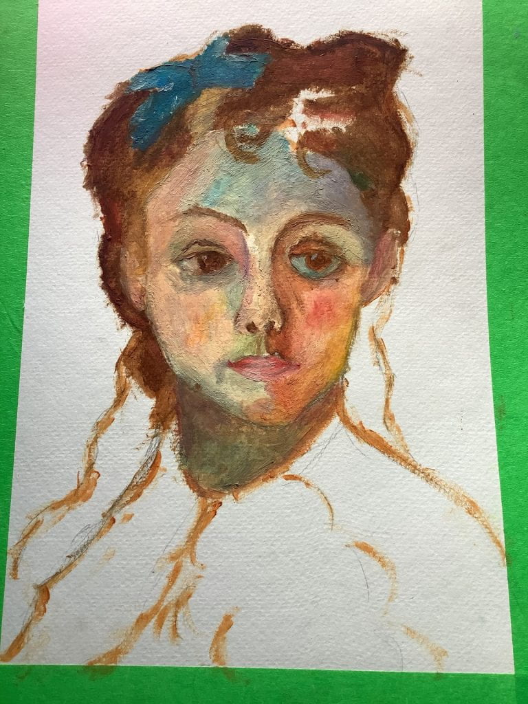
Firstly, I used a 3B pencil to sketch out the overall dimensions.
Sketch
Derwent 3B
Then, I added base layers with watercolour. I found that paint residue left over from last project was floating up to the surface of the water in the cup, if that makes any sense. It doesn’t bother me, but is pretty interesting to note.
In previous projects, I had originally started with an important part of the person, such as the eyes. Then, I would paint on lashes and get on with it. This time, I decided to build up from the less important parts, as then I wouldn’t smudge the lashes and details. This sort of worked, but I got really tired and bored by the end, so I didn’t put much effort into the more important parts of the person.
Base layers
Something else I forgot to do in one of the earlier stages was to remove the pencil reference lines. You can still see it in the final product.
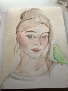
After, I made some the colours more definite and added on the final details, but I can see more area for improvement.
Final piece
Before we continue to areas of improvement, I forgot to record myself drawing this! After I had finished, I had an eureka moment, where I realized that I could use my music stand to perch my iPad on and then record the whole entire workspace in a timelapse. Next time, I will be sure to do that!
What’s a Watercolour Block?
Before, I would use watercolour pads to create my artworks, but I found them so annoying to work with. Before you even started the artwork, you would have to cut it to desired length and then tape it down on all 4 sides. I found that so annoying and it wasted a LOT of my time.
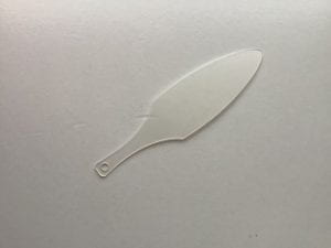
Then I found this thing called watercolour blocks. They’re paper that’s glued together on all sides. It’s basically taping the paper down for you! All you have to do at the end is grab this little “paper knife” and then run it along the sides to break the glue! This intrigued me and since blocks and pads were both similar costs, I decided to try the blocks. This is probably something that I will never leave again, I can usually set up my whole entire workspace in less than 10 mins now! (I am quite well aware that that just sounded like a advertisement to buy watercolour blocks.)
Paper knife
I also remembered to Timelapse a really quick video of my removing of the paper.
Areas for Improvement
I find that dimension is still a thing I need to work on. This face still feels distorted and I need to make sure it doesn’t. I also need to make sure that my reference lines aren’t in the final product. Overall, I rate this a 9/10 for experience, mostly because of the new brushes. A 8/10 for the final product.
The issue is that I am not committed. Sure, maybe the thought of improving digital art seemed SO COOL last week, but now I’m not so sure anymore. This is often recurring (as you could see with the music issue) but I can see that I won’t finish anything if I don’t commit to the plan. Often, my plan revolves around what I feel like doing that day. Once I wrote 10 pages of a story in a week, then I left it for 5 months and, suddenly, I’m back up again, writing another 14 pages in two days. As you can see, this trait certainly is not helping in the process. Not only that, but my schedule is only going to fill up for the next 3 weeks to come and I don’t think I will have much time for this.
Let’s try to continue…
I’m sick of digital art. Already!! I think that this week, I will focus on watercolour. I have absolutely no idea what’s going on anymore.
This week, we will continue our imitation of SamDoesArt’s style. This is a good starting point for me as I like the style and it is a hard obstacle to pass. I will require a lot of skills that his style has, as it has a lot of rendering, which is basically making a thing look more life-like. From last week, we have deducted that I somehow need to make it more 3D, as right now it looks very 2D. I think I can fix this with more lively colours (brighter than usual).
References
I tried to pick a picture with a lot of lighting to help me work on rendering. Again, only the face will be used.
Reference Photo 2
I will be using this reference photo from SamDoesArt. I try to find a similar angle the face is shaped in. (I can flip it visually to match my photo).
The Process?
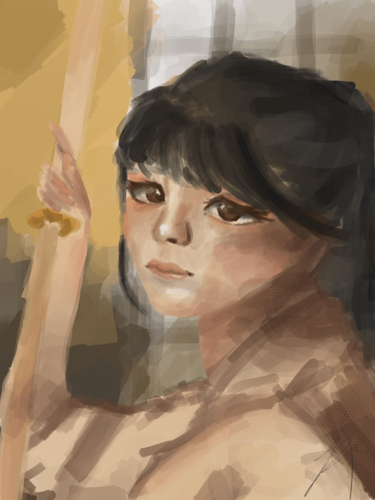
Since I went in-depth with my art process last week, I will just post the final product and video this time along with my commentary on the side… My only question as of now is why the girl is holding a stack of paper?
It’s been a day and here’s my current progress:
I think it is disastrous as of now. I don’t think I managed to capture the look using the eyes and the skin lighting is way too red. I’ve decided to finish the hair but not continue the face area for now.
Restart?
After careful consideration, I have decided to maybe restart this project. It is not uncommon to have unfinished projects in the world of art, but I try to complete every piece. I will put this on the half finished pile of works and start a new one since I want to have a new clean slate to work on.
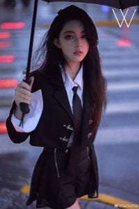
Reference Photo 3
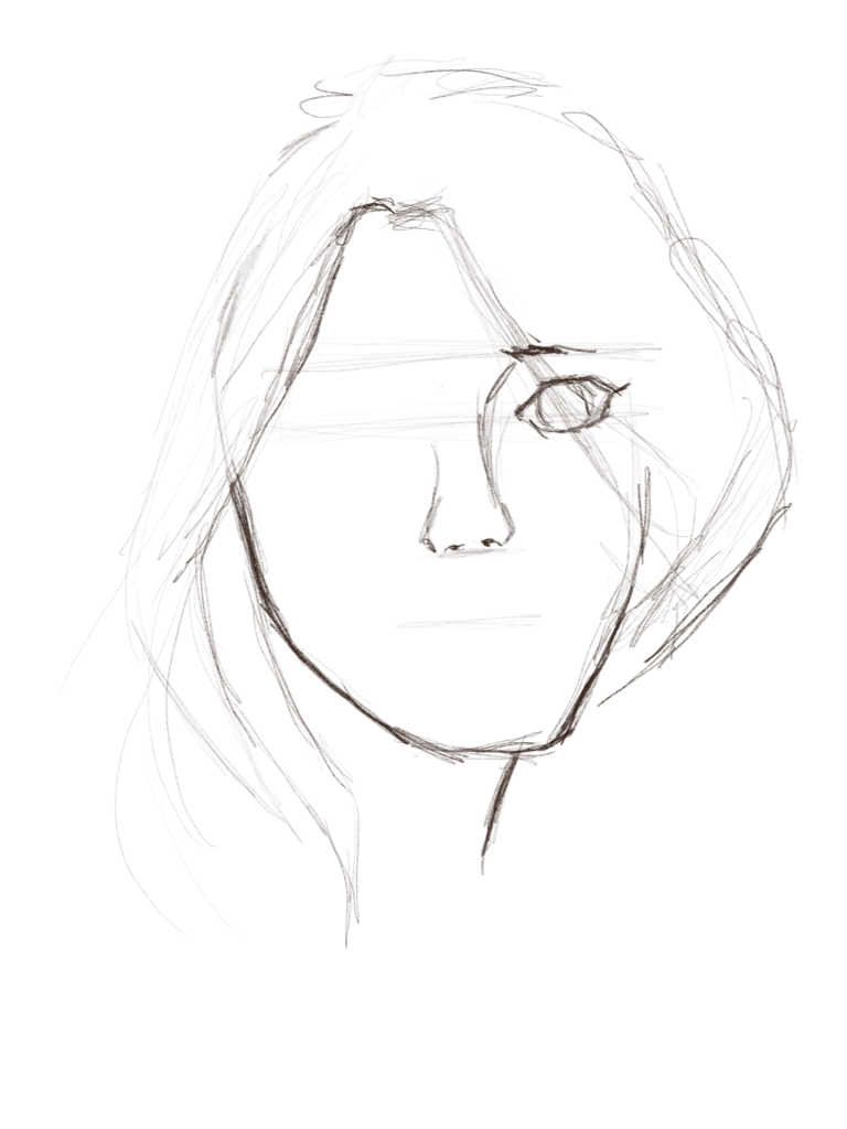
This time, I’m going to try lineart. I’ve not really had much success with it before, but this time I will approach it differently. I ‘m going to use the first sketch I make as the final lineart for the project, just like traditional art. I’ll also try to use the same layer for the whole thing (maybe).
An issue I am experiencing as we start is the brush is very small, which isn’t good since that will make me want to make it perfect, as an avid perfectionist I am. I think digital art is more enjoyed far away, since screens aren’t big, therefore there shouldn’t be any small details as it is a “waste of time” and very annoying to me. Part of this issue is probably coming from the ability to zoom in, which does not help.
[Future Rachel Here] I have lost interest in this piece, but I will show you what I had. It’s main affect was drawing the nosebridge which is affected in my sketches.
At the time, I really loved how the nosebridge looked. It seemed so organic and it really was my vibe. It also made mapping out the different parts of the face easier.
After careful consideration, our group have overall agreed that this music idea may not be the best fit for our first genius hour project. This is because last class, we accomplished nothing by fooling around in the music room. Our instruments also are more affected by weather over winter, and I don’t feel comfortable bringing it weekly to school. We have rethought our ideas and will be postponing this idea (maybe) to round 2 of genius hour (February-June). For this winter season, I have planned to get better at digital art (see Digital Art progression in menu for more info).
Time to go on Pinterest to find a reference photo! Here’s the one I chose:
I will only use a zoomed in version of the face for this artwork – better to focus on faces for now.
Which Style will I try to use?
I will try to use SamDoesArt’s style this week, which will definitely fail miserably, but that is beyond the point.
SamDoesArt Artwork
The Process
The Sketch
I have observed that SamDoesArt has a very organic way of drawing. He uses a minimal amount of colours and uses very natural shapes.
Adding Base Colour
In some of his education videos, he first applies a base colour to the portrait. Then he alpha locks it, which is basically making you only be able to colour the coloured part, not the background.
Add more colours
Then he recommends to add some warm and cold colours to be able to make the lighting existent. I decided to also add the other colours. We will see if it helps in the end.
Final Product and Thoughts
The final product is now out! I personally think this artwork really improved my skills compared to the last one. I really gave a lot of thought into it! Although, I can see some mistakes that are extremely clear. I will learn to change it next artwork.
Artwork 1 – 11/13/2022
Along with all the cool features Procreate offers, there is an option of a speed through of the whole process! Throughout the video, you can see me fiddling with a lot of different brushes and techniques, especially near the end.
Artwork 1 Video
I used 4 layers for this piece. Sketch, Rendering, Multiply, and Background.
Layers
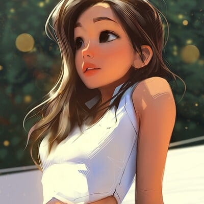
As a reference photo from SamDoesArt to mimic his style, I chose this one:
Reference Photo 2
Compared to mines, you can see that his has more dimension and more contrasting. Mines is more bland and 2D. Next time I can work on that more. My favourite part of my art is probably the lighting effects that I used. It was out of my usual comfort zone, but it gave a bit of dimension to my piece and made me love it!
Areas for Improvement
Some improvement areas that I can clearly see are the right eye (left side for viewer) and the mouth. The mouth looks pretty nice when zoomed out with the whole piece, but it’s way too 2D and it is definitely not in the right shape for a 3/4 view. The eye was pretty good, but some blemishes have appeared over it and it now looks kinda blurred, which isn’t the best. I would rate this experience an 8/10.
This week did not turn out as expected. Although I brought my violin there since I needed to play for a different event, I did not feel really comfortable working with everyone. I don’t think I will be bringing my violin next week as it is cold and my violin shouldn’t be outside at all. Mostly, I have a bad gut feeling about this idea and although it is a good one, I don’t want to have to bring my violin every week. As of now, I don’t know if I want to continue this idea, maybe I can start on my other project, but I would have to talk with my partners and I don’t want to crush all their hopes and dreams.