Yes, I’m back everybody! I feel like I’m losing a whole lot of interest on this genius hour. I have only been using the 1 hour block at school to work on it since I just don’t feel like taking more time on it. Still no reply from Mrs. Serfozo so I’m kind of worried since we only have a week or so left. My final presentation is needing some help, I think I created the slide but haven’t put anything on it. Today my plan is to draw out a timeline for the presentation. I also want to create some points that might be useful for the presentation. I want to gather some key advice that might be useful for anybody doing a similar project.
I’ve decided to brainstorm some points here:
Patience – you need patience or your paintings will end up like this (show paintings) and you will feel like this (show picture)
Be inspired. If you aren’t inspired, you won’t be able to create. If you can’t create, then your paintings will end up like this and you will internally feel like this.
Dedication. If you aren’t dedicated, your paintings will end up like this, and you will internally feel like this.
It’s okay to fail. We all do it. (Show some failure pictures)
It’s okay to change ideas. Changing ideas shows that you are actively participating in your project and that you are giving yourself comments and feedback on how to make your artwork better
That’s it for now. I think I can gather a solid 5 mins speaking for each of these 5 points. I really hope that through a bit of advice from the speaker (which is, of course, me), the audience would be more engaged in the slideshow. I don’t want to present something that would feel boring to both the speaker and audience. At least I would enjoy it this way. That’s my brainstorming blog post for now, see you soon!
This week, I really want to focus on my presentation. I realized that most of the evidence (through photos and videos) are stored on my iPad, which I did not bring to school today. This means that I need to use my time right now for something else. I don’t know if I should continue making my presentation on Sutori, or if I should just use google slides. I really want to create something that looks like a timeline, but both Sutori and Google Slides don’t provide that. Since most of my materials are at home, I hope that today I can find something that is interactive that I can use for my presentation.
Update: I found that Adobe has a timeline maker, but it seems pretty limited so I will try to find others.
Update 2: After going through the internet, I have concluded that the most logical idea would be to use Google Slides.
Professional Update
Ms. Serfozo has sent my questions into the world, but the problem is that nobody has answered. She told me that she wouldn’t give up though.
Good news and only good news this time! Yesterday, Ms. Serfozo came up to me and told me that she had emailed 3 experts in the area. Except, due to their busy schedules and other difficulties, none of them have answered yet. Ms. Serfozo, however, has contact with a lot of other art teachers across the Americas and she could upload my questions to an online forum.
I’m having some difficulty trying to decide what to do for my final presentation. It’s worth a lot of marks and it can only be 5 mins. I was thinking of some timeline-ish thing along with some tutorial videos and facts from the expert, etc. I don’t want to necessarily use google slides to create it, though. I was thinking if I could find some other free website that was specifically meant to make timelines, it would be better. I will mainly research that this week.
Update: I have found a timeline website that seems legit. It’s called Sutori and it’s meant for students and teachers. It’s a bit hard to maneuver around – I haven’t been able to find the delete button yet – but with a bit of knowledge, it might be a good way to present my presentation.
I need to keep in mind that I am not writing my notes on the screen, but more that I am uploading pictures and evidence. Just now, I forgot about that and I just realized my mistake.
Bad news or good news first? Let’s start with good news first.
The good news is that I finally created another piece! I’ve been busy lately and haven’t had the chance to do another piece – but I was in a circumstance yesterday where I only had my ipad on me and there were issues connecting to wifi. Luckily, procreate works without wifi too so I was pretty lucky that way. I wasn’t expecting much at the start – it wasn’t like I was wasting my time since I had nothing to do. I liked how it turned out, messy but simple at the same time.
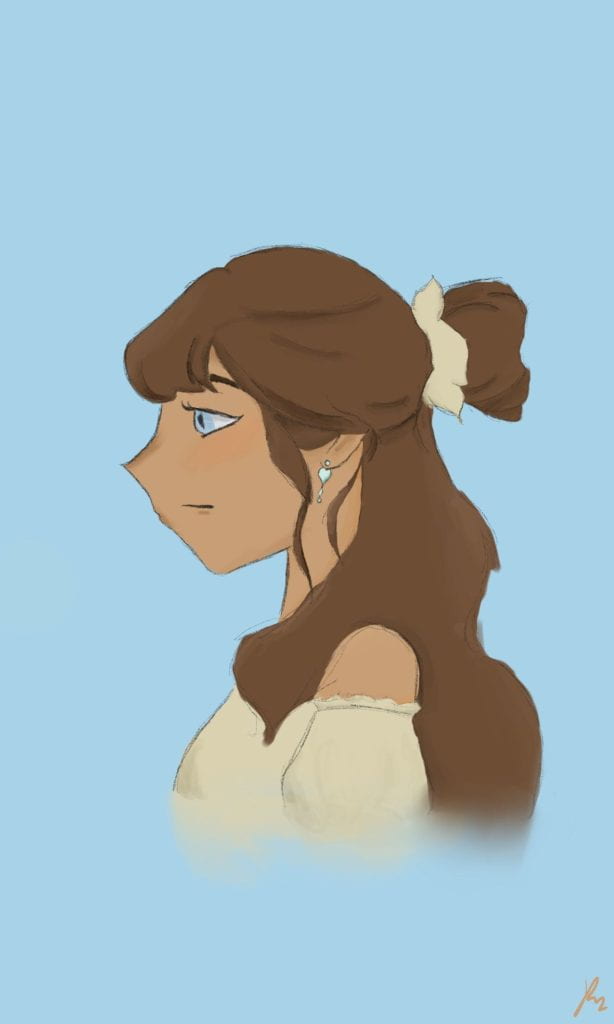
Digital Genius Hour 2 – 1/30/2023
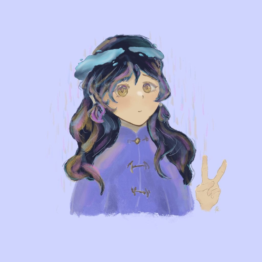
I like this artwork as it portrays a character I made whilst writing a novel. I’m definite that my novel writing is far from what others would call “good”, but it’s one of those pieces where even I get hooked in reading what I wrote! It’s so cool to be able to go like, “OHHHHH” when I read a really good part of your creation. I mean, it’s THAT good. Plus, it’s so rare (in my opinion) to be able to feel that way from something you’ve created. Moral of the story is that I don’t come across these kinds of things often.
Originally, I did not plan to render it AT ALL. I was just expecting a rough draft that I wouldn’t come back to, but once I started on the face, I just continued. The rendering is really messsy such as the clothing lighting is super duper off – I put the shadows on the wrong side. I was going to create another lining of the character, but got lazy and just used my original sketch. I like the background, it really portrays it as simple and is really contrasting to the character. It wasn’t how I imagined it, but perhaps even better. Overall it took me around 1.5-3 hours to complete it. I like it a lot so I would give it a 8.5/10.
As always, I have included a video for more evidence.
Now for the bad news
The bad news is that I still have no reply from Ms. Serfozo or the expert. I assume it’s because they’re both very busy and don’t have the time to view it. I will remind Ms. Serfozo during art tomorrow.
After my numerous attempts to contact Ms. Serfozo in hopes of finding some artists in the area, she finally had some news! She has around 3 or 4 artists whom she thinks may be a good fit for my project. Some of them don’t specialize in watercolour specifically, but they do have a lot of different types of styles that I find very interesting. I also am not specifically improving on my watercolour, but art in general. I am having some difficulty with finding some questions worth their time, so I do need to improve that. For now, I am going to create a google doc to write a draft email.
I think this email sounds pretty formal. This is how I normally format my emails, so if I am making a HUGE mistake, then I’m sorry. The main problem right now is the questions. Some of them are a bit too specific, where as others are not specific at all. I also don’t know what the art teacher thinks of it, so I will also send it to her too.
Last week, after Genius Hour, I had a moment to ask Ms. Serfozo if she could introduce me to some talented artists in the area. She had a list of a few people I could contact, but she couldn’t find the list so she told me to wait until this week. Unfortunately, I’m afraid she may have forgotten as yesterday, when we had a double-block of art, she didn’t approach me. I am a bit confused as to if I have to take a lesson, which I think would be wasting time and effort for the artist and I. I think the best form of communication for me would probably be through email. I will ask some questions about art to the artist. Since my project has a very broad goal, I don’t really know what to ask. Some questions aren’t good as you can search it on the internet, and this isn’t a interview either. I think this project was extremely self-led so it doesn’t really make sense to ask an expert. I shall brainstorm some questions on the spot:
What kind of watercolour paper do you use? What paper would you recommend for beginners?
What’s your most favourite form of art?
What are your thoughts on watercolour?
Would you recommend watercolour as an art medium for students/beginners? If not, why?
What kinds of watercolour materials would you recommend for intermediates? Any particular brands?
I feel like a lot of these questions are super mainstream and are a waste of the artist’s time. Consultation with a friend can help make them better.
Final Project
Last week, I worked on a little bit of my final project. Unlike what I did for most of the year, which was watercolour, my base was acrylic. I really needed to use up all my acrylic because it was taking up space. I tried filling up the space that I haven’t painted with acrylic, but ended up making it look super bad. I plan to hot glue some watercolour paper with watercolour on it onto the canvas and to add some 3D aspect to the piece. I want a back-up for if it fails.
The back-up
As I explained next week, I had an idea to make a deck of cards out of watercolour. I feel that it would be an accurate representation on what I learned in the weeks before, and I’m pretty excited about it. Because of it’s small size, it would be great to bring ot school and pass around. I am pretty busy these few weeks because of festival preparations and new year’s festivities though. Ideally, I would like to complete both of these projects before the presentation.
There’s officially 5 weeks left of Genius Hour #1. Over this time, there are a few things I must complete:
Find an expert that can help me improve
Create a final project(s) that will demonstrate my improvement over the years
Compile all the evidence I’ve had into a slideshow of some sort
Create a timeline? Something that can show some timestamps regarding artworks, changes in genius hour plan, etc.
I will add more to this as I go.
Recap
On the first week of this genius hour project, I decided to go with a improvement in digital art. After 2 artworks, I decided that this is maybe not the best idea. I found that it took a lot of time jumping through the different layers, and I wasn’t very familiar with the brushes. It took a tremendous amount of time, which, at the time, worked, but I was later going to become very busy. In order to have continued, I must have had to have an extremely well-managed time. I also lost interest after a while and noticed that watercolour was a very fun art medium to work with. Not only that, but I had all the materials required to do it, and it took way less time as I was more familiar with traditional art. Now, instead of an apple pencil and an ipad, I use brushes, paint, paper, etc.
Expert??
I have no idea what to do with an expert. At first, I wanted to find the school’s art teacher, Ms. Serfozo. But, Mrs. Englot recommended that we should find someone outside of the school building as that would challenge our skills to be able to have some real-world knowledge. I haven’t done anything yet, but I have some things considered:
I used to go to a art place called 4cats. They have excellent sketchbooks but after a quick search on the internet, it was found that they may or may not have closed down. I also looked into it and it seemed that they worked more with pottery and clay than paint. Either way, they would be very far from where I live, so my parents would probably say no.
Find one of my old art teachers, but it would be awkward as they both teach in mandarin which means that i would have to translate and that may take some time. Also because it is difficult to contact them again as I haven’t been taking any art sessions recently.
Find Ms. Serfozo and inquire about any art people she knows. That way, I can be backed up by saying that Ms. Serfozo has recommended me/them and maybe I can possibly be able to reach some people with a lot of art background
Those are my ideas for now. This afternoon, during options, I can ask Ms. Serfozo about that and see what she says. If I’m lucky, I will be able to recieve a phone number or email. If not, I will have to resort to plan b.
End Project
I think an end project would be great to finish off this project. Not only would it take more than 1 week, but it will help me document my project more immensely and that it would signal as a wrap-up for this project.
I was going to think of doing mixed-media, and that it would be cool since it could show all of the mediums I’ve worked with
I will also show some mix-media from before.
I had a previous idea, which I mentioned a few posts ago. It was about creating a card deck. I could do 4 cards every week or something! It would be great to work on proportions, bordering, and colours. I plan to use watercolour paper to make the cards, instead of actually painting on cards as that would be difficult.
Something involving a canvas? I’ve tried before and it has failed miserably…
Compiling EVERYTHING.
It just hit me that I could include art projects from when I was younger. As in when I just moved to Canada and went to those community center projects and stuff. I hope that a showcase of stuff when I was younger would really signify what I have come from, what I used to do, and what I do now. Not only that, but the showcase on a slideshow would be a great memory for me to keep.
Finding EVERYTHING.
In order to document and take pictures, I must find them. Luckily, I know where most of the stuff is, unless something changes drastically from now until February.
Timeline?
Yeah, that’s going to be hard. I will only do it from September 2022 – February 2023. I’ll draw it on paper because I’m too unfamiliar to create it on computer.
Overall
I guess I did lose interest over time on digital art. I hope I won’t give up on it in the future, if I do decide to try again for the third time. I’m not sad that I did, as it would have been harmful to my eyesight too. I just didn’t have the most crucial material required for it: Time. I’m excited for the next project as I will have more time cleared out after May. If all goes well, this project will end off well.
Over the past year, I’ve been introduced to many new art styles, techniques, and mediums. It’s been a very explorational year. Not only in art, but other subjects as well. This has been quite the rollercoaster. I’m here to share with you some of the awesome stuff and the not-so-awesome stuff that has been collected throughout the year.
Early 2022
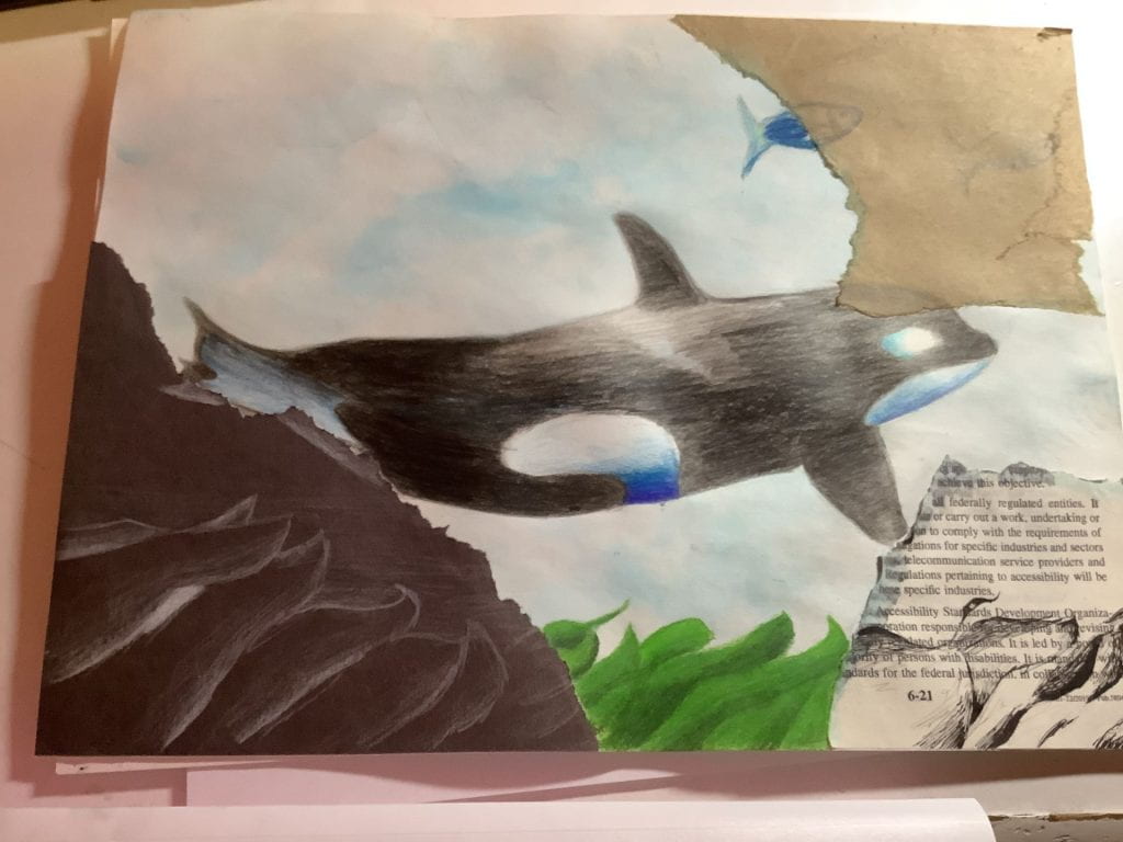
Orca 2/15/2022
It was a shadow pattern thing. 2/22/2022 (Also, that’s a lot of 2s)
Started off nice and strong with some mix media. We had to do it in school and the resources were there, along with the surplus amount of time that they gave us. Enjoyable, lighthearted. Although for the orca one, I was pretty happy but my teacher kept making me change it. Kind of annoying.
More from March and April..? They’re stuck on my wall so I don’t know.
Dragone- April 2022
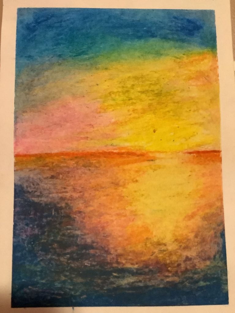
Sunset – April 2022
Sunrise – May 2022
I didn’t have high hopes for any of these. Since I was busy outside of school, these were all completed in class. Normally, teacher expectations are lower than mine. Sometimes my expectations even surpass my mother’s. Didn’t know that was possible.
The Sunset one was made with oil pastel. Normally, oil pastel is not my forte. I completed it in 1 hour. At the 40 minute mark, it was looking pretty hopeless, at least to me, so I was just thinking, “I’ll just finish it regardless of how it ends up.” Look at how that went! I really needed a viewer on the outside to help me see it through different lenses because when I was done, it still looked really bad to me. Of course my friends were really excited to see how it turned out and I also flipped out after I came back to see it posted on the wall.
The watercolour sunrise was an idea put forward by my former, former art teacher. Many people were going to create a dark background on yellow paper, which is a pain. She suggested that we could work with the colour of the paper and I took her advice. Honestly, the colours could have popped a lot more. I feel as though it’s really dim (probably because it is). But it gives a really mellow feel, which I love. The inking in the front was really nerve-racking as I didn’t want to ruin what was already there, but it ended out really well!
The Dragon one was a disaster. My original plan was to make layers of watercolour into a city, just like we were instructed. Except, I accidentally made one of the first few layers too dark and everything went downhill from there. When I thought that this project had failed, I saw a droplet of water on it and was immediately intrigued by it. Why didn’t I see it before? I don’t know. It seemed to had dried perfectly so it probably was on a lot earlier than when I found it. At first, I thought that it was another addition to the mess I made, but after that, I realized that it could become a lantern. After all, the city was known for it’s lanterns. Adding more droplets of water was bound to make it messy, and some of my friends thought it was a volcano exploding in the end. But that doesn’t bother me. I also added lining with ink to make it pop out more, since it was all over the place at that point. I added sea monsters, a dragon, and some clouds. Personally, I like the clouds the best. Was this what I expected? No. Did it turn out well? Perhaps. Do I think it has a lot of meaning, history, and symbolism behind it? Absolutely. I think it took a long way to get here and the process was painful but worth it. It was way out of my comfort zone but it somehow ended up perfectly. This was probably one of the best artworks in relation to the journey it took to get there.
There’s 2 more even weirder stories regarding artworks and their journeys, but maybe that’s a bit too out of my comfort zone to share with everyone.
Mid-2022
Not my usual medium
Birb – 8/6/2022
Drip… – April 2022
Seelie? – 8/5/2022
Pretty interesting, huh. I particularly like the ‘Drip’ one in the middle. I had to come up with it in a few minutes, since it was during an improv session, so my time was limited. I made another one called ‘Imagine Dying’, of which The Most Awesomest (Cello) Teacher I Have Ever Had (Please don’t send this to any other cello teachers) had promised to hang up on his wall. I liked ‘Imagine Dying’ better, but only by a bit.
The others were from after I went to the Heritage Festival and got this handy dandy crayon star thing with a lot of colours to choose from. I’m pretty sure I drew ‘Birb’ in the early morning when I was still half-asleep. Still like it though!
My Usual Medium (At the time)
Lapis_ – July 2022
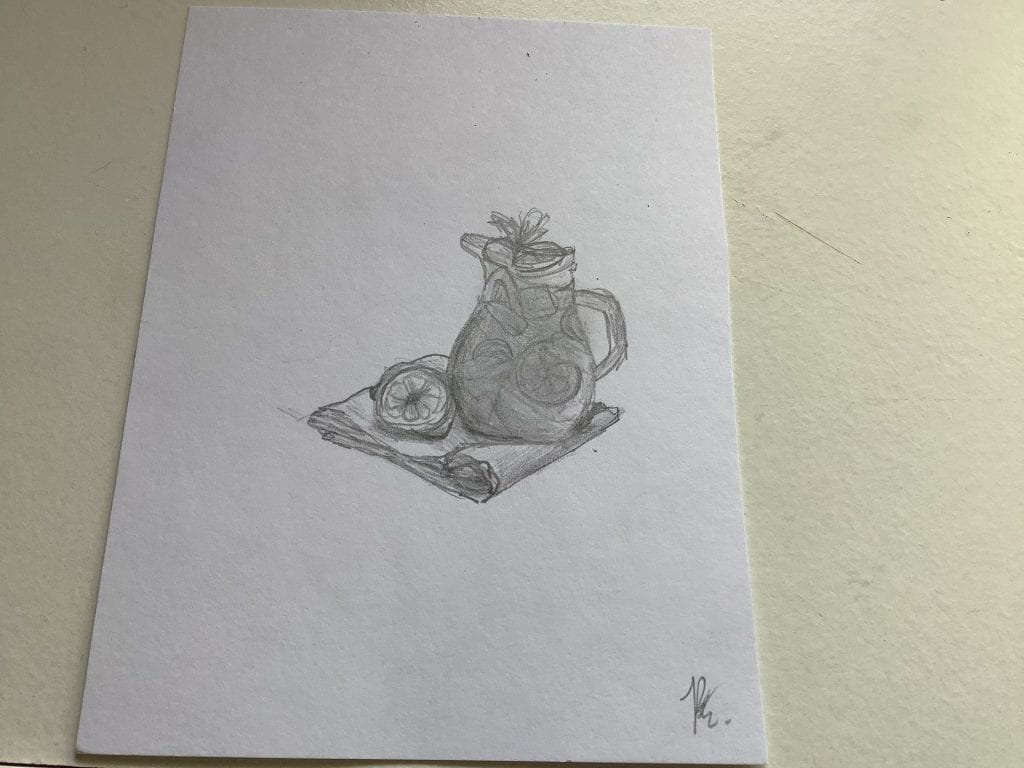
Lemonaid – June 2022
Nami and Me – Old.
Honestly, July would’ve been great until something ruined it. I’ll spare you the details. Lapis_ was for my profile pic on some platforms, because I felt that it was kind of rude to take other people’s creations. Lemonaid was for a friend since I was leaving the school to come here. She reminded me of lemonade so I drew it. I named it Lemonaid also because she needed aid. As in drama-related. Yeah.
Late 2022
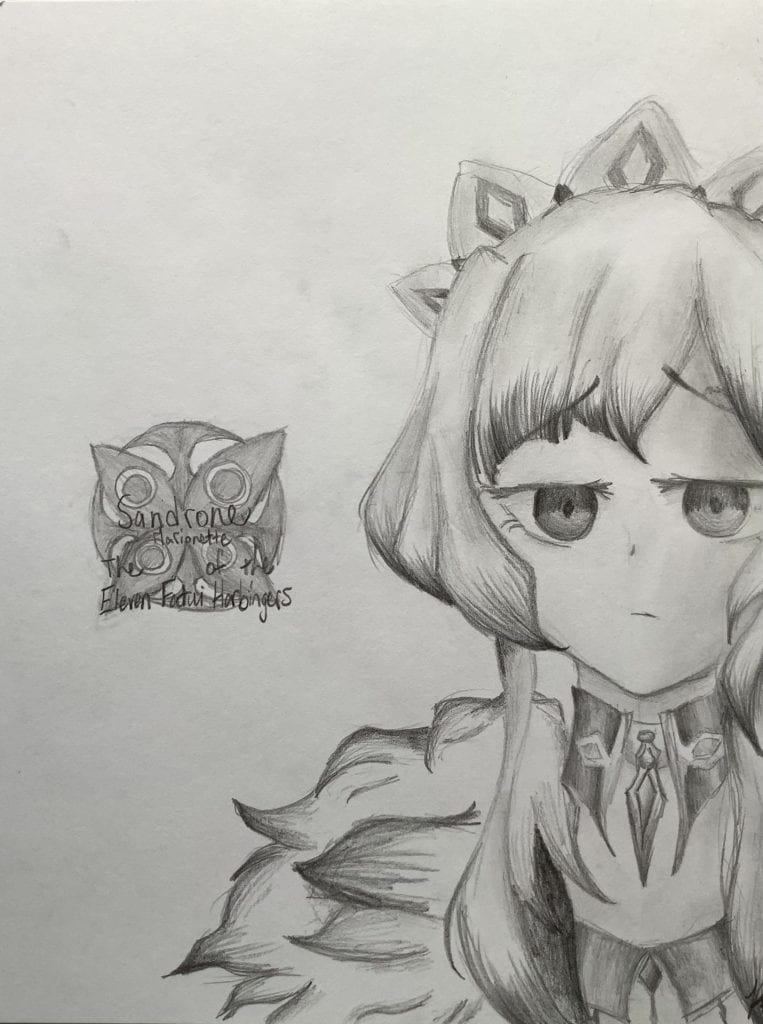
Sandrone – August 2022
Side Profile – August 2022
Linh 8/31/2022
There’s nothing much. I kind of lost motivation over term 1, but believe me, I’m trying to get that back! And make it even better! Also because I started making Genius Hours so I’ve already shared with you a lot of cool stuff! I like Linh the best, she’s awesome. I’m surprised that I could make such a good piece with some bad brushes. Though, there are some issues with the nose and mouth. They seem really 2D.
Some beginnings of my new style… (More elaboration later!)
Beware! Viewer discretion advised! Risk of absolute disgust! (I understand!)
I haven’t shown you the first few attempts of my new style, yet! Don’t be too excited, it’s absolutely hideous (for my liking).
Don’t worry though, if you are able to survive through this portion of the article, there’s much better drawings that don’t make your eyes sore soon! More description of this new style can be found underneath this monstrosity.
1
2
3
4
Attempts at new style – 10/8/2022-10/10/2022
She looks like a caveman. Or should I say cavewoman. Not only is her eyes way too big, but her mouth is too! Her eyes are just creepy.
His was pretty okay. The shading was great, but the frame of the face could’ve been bigger, in relation to the eyes. His hair was a challenge, but I added so much shading that it actually looked okay!
Her eyes and mouth too… A bit too much. The eyebrows were starting to take shape, but her face frame was too child-ish, which resulted in her looking like a 10 year old. Her braids were a bit poofy for what I had imagined, but that’s okay.
Now this one was actually getting somewhere! She had a definite expression, her jaw was clearly defined, but her hair still had that cartoon-y element. Her lips and eyes are still too large, but overall, it looks pretty well-done!
Comparison through Styles
Recently, I drew an awesome piece of a character that I’ve also drawn over summer break. She’s my most favourite character – nothing can top that. Out of curiosity, I decided to pull out both drawings to cit!ompare. Let me tell you, never have I ever been so shocked at what came out! I hadn’t even noticed my improvement. I 100% like my new style better, but it’s up to you to decide. (Also no hate on my old style please, I KNOW it’s cringe, and I do agree that it does look really bad.)
New style obtained in October 2022
Old style obtained in July 2020
I KNOW. LOOK AT THE DIFFERENCE. And yes, same person. Maybe different hairstyles, but that’s it.
Let this be a moment that I’m actually proud of myself before I get back to high standards.
Honestly though, look at how far I’ve come!
Before, I used to draw lines as mouths and a lot of it was based on cartoon-y styles. I liked how the hair was very flow-y. It doesn’t follow the rules of gravity. The eyes, however, are extremely overdone. There were a few months where I was so annoyed at the eyes. Why were they so hard to get right?? A lot of it were just lines and minimal shading, the one I’m showing you were one of the only ones with a bit of shading. It really matched the style though, so I’m happy with my old art style. Being able to draw cartoons and semi-realistic is great! That way, there are a lot of different techniques in your inventory.
Fun fact, I actually discovered my newer style on a road trip to British Columbia! I was getting pretty bored of the old style and at school, we had to create a drawing with the accurate proportions to the human face. At first, it was hard to get right. Usually, the eyes were too on the side of the head and the mouth was too low. I was aiming for a completely realistic style, but I settled for semi-realistic. Oftentimes, my sketching is too quick, so I don’t spend enough time on it. That’s maybe why I am not suited for a complete realistic style, but this one’s close! I like this style because it’s very simple. Nothing too messy, just a face. Nothing too eye-catching. It just blends into the background. While drawing, I also noticed some things that I do in my art, that I haven’t seen people do online: I connect the bridge of the nose to the eyebrows. I’ve been told to not do that, but after a sketch with it accidentally, I found to love how natural the lines looked with the nose bridge being drawn in. So, I did what any artist would do. I added it in! After two months of trying to adjust to it, I’m pretty sure I got the hang of it!
That’s it… See you next year!
After all of that, I am very pleased with my progress and development this year! I was mostly motivated towards the end and I have discovered new ways to create and express art. Creating blogs definitely isn’t my thing, but I’ll spend some time on it, if I have the time. From when I’m writing this, we have 2 days left of 2022. I hope 2023 won’t be as disastrous as the previous! See you on the other side!
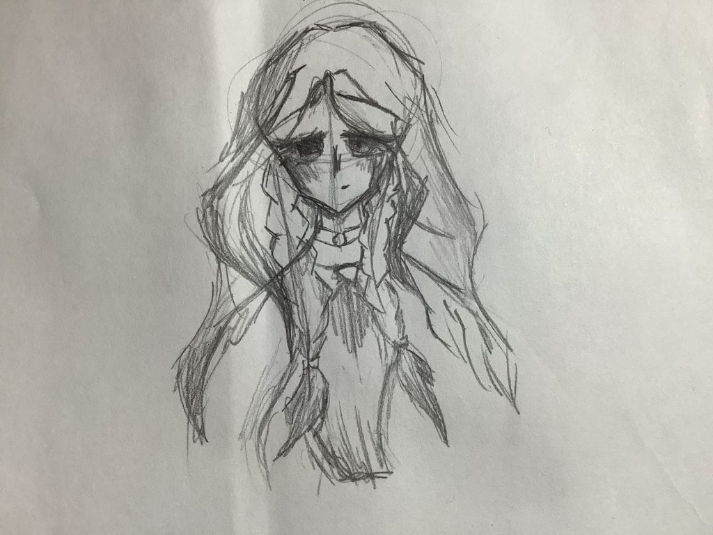
This week, I chose to take a break from watercolour. I’m quite busy this week since it’s Christmas, but next week, I promise I’ll pitch you my great idea.
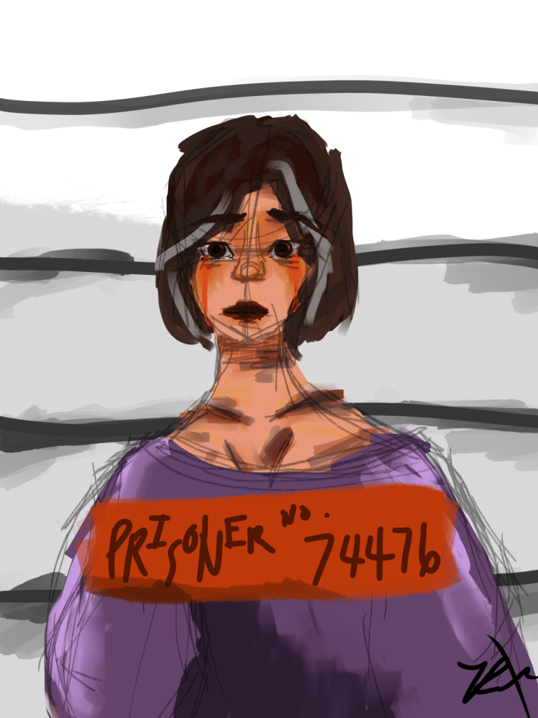
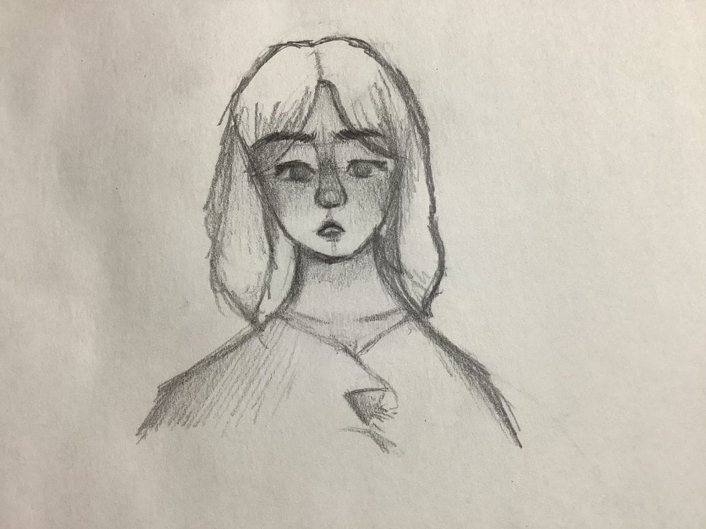
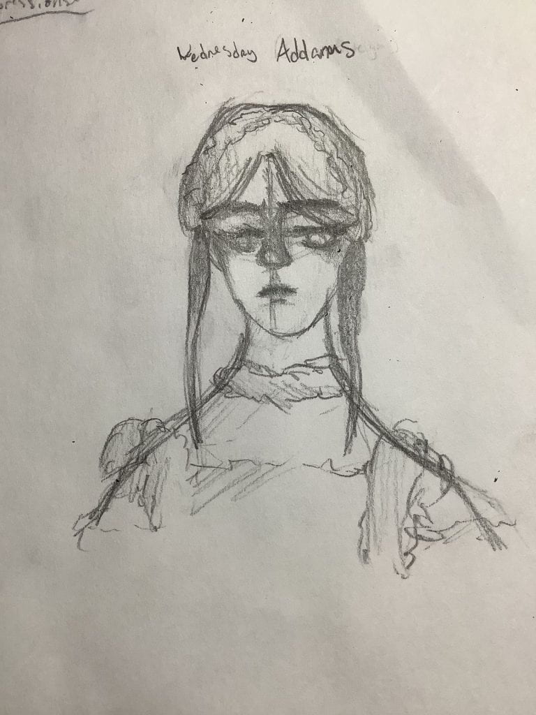
This week, I decided to play around with facial expressions from the TV series, Wednesday. All characters, regardless of what kind of arts portrays them, all have a lot of background. I chose Wednesday mostly because I just finished watching it and the characters are still fresh in my head. Each of these drawings took me around 5-10 mins to complete. Please note that all reference photos used for guideline were only to follow the hairstyle or clothing choices. All facial expressions were of my own attempt.
Wednesday
Wednesday was the first character I chose to draw. She’s very self-centered and doesn’t care what other people think, somebody that I look up to. Usually she’s expressionless in the episodes, but I wanted to draw her with a grim or disgusted expression since I haven’t had much experience in it. I think it turned out great. If you’re wondering where the braids went, I chose to draw it at the dance, when her hair was up. Some areas of improvement could be that her hair can be more evenly coloured, as it looks imbalanced. Her right eye is also kind of smudged and the eyelashes are a bit all over the place. The expression has been made very well, I’m extremely content. Would rate this experience a 9/10.
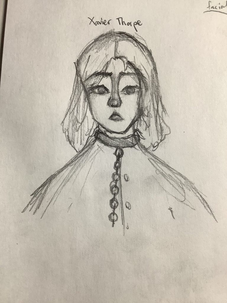
Xavier
Xavier is a wrongly accused student, because Wednesday always jumps to conclusions. He ends up in chains and I thought that it would be a great way to demonstrate his fear at that moment.
To be honest, I thought at the start that I was drawing a girl. I drew the eyes and immediately was determined that he was a girl. To even it out, I squared his jaw more and made his hair more messy. Out of all the people I drew, I definitely liked his nose the most. It’s very symmetrical and nice overall. To draw his expression, I looked into a mirror and tried to act out the expression. It helped a lot with the mouth since I’m not very great in that portion. I also loved how I drew the lips, as they fade out very well. Previously, I’ve been drawing mouths as lines, and I’ve just recently (around a month ago) started to draw in this semi-realistic style so I’m fairly new. His eyes ended up matching well in the end, and the expression was really on-point. I enjoyed this one a lot! Would rate it a 10/10.
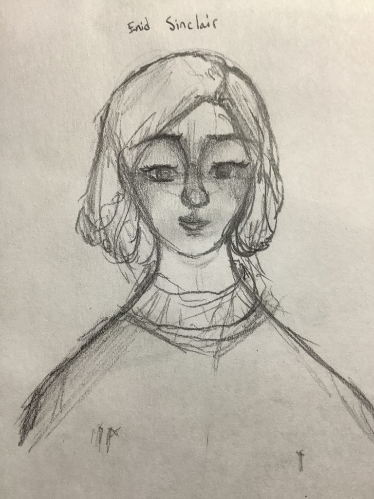
Enid
Enid is very different from the other characters in the show. She has a bubbly personality and her side of the room is extremely different to Wednesday’s. She has a very sincere look in the drawing, which was not 100% my goal. I think I wanted her to be more happy and bright than sincere. Her eyelashes look great and the blush is pretty cute. I had troubles with her hair, of which I followed a reference regarding the hairline. There is a lot of skills to work on with positive expressions. Over I would rate this a 8/10.
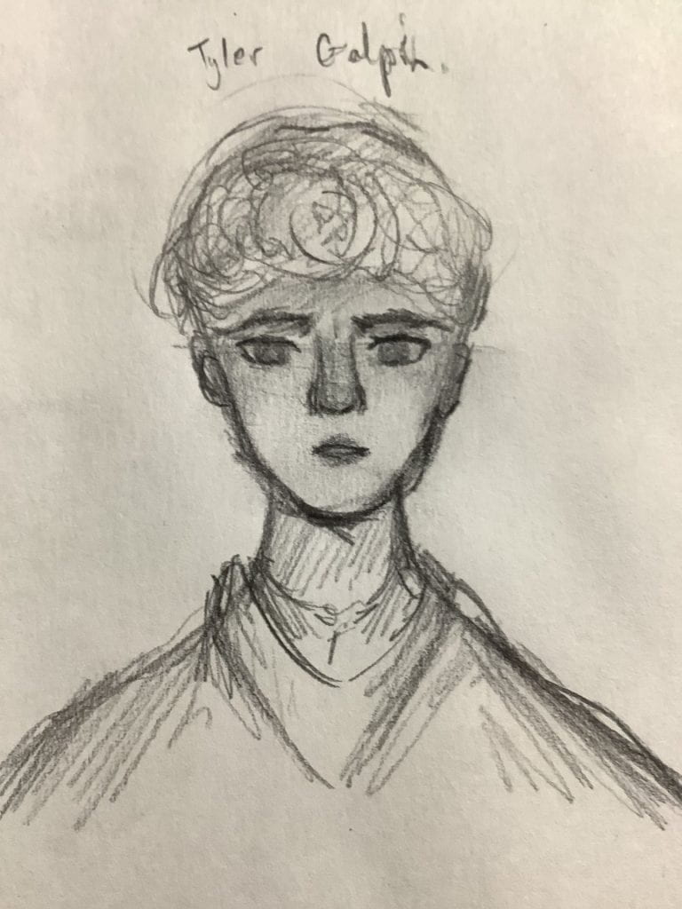
Tyler
Tyler’s was DEFINITELY the most difficult out of all of them. I wanted him to have an evil, but not too evil expression. Like one with revenge. Did it turn out like I planned? Sorta. The eyes and eyebrows were definitely how I imagined, but the lips are a bit off. I wanted them to have a smile curling at the lips, but it just ended up looking like he looked betrayed. His hair is one of the hardest hairstyles I have ever tried to draw since it’s random. The curls go all over the place! I can’t even think of where to place them! On a brighter note, I do love the lips. Unlike it’s failed attempt at a expression, it’s very full and I liked the blending of them very much. his mouth it open just the slightest crack, but we can see those picture-perfect teeth underneath. This definitely didn’t turn out as well as I hoped, so I would give it a 6/10.
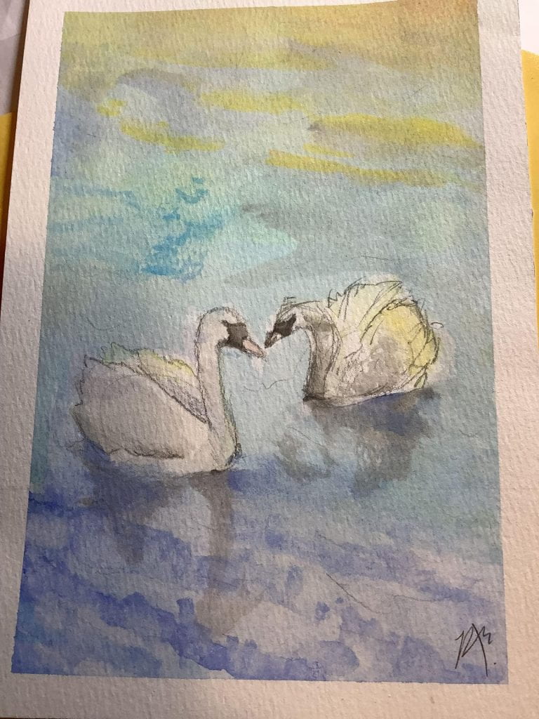
This week, instead of doing the usual human artwork to improve on my human proportions, I decided to do something different. In case you haven’t been keeping up with the current news, it’s almost Christmas. If it’s almost Christmas, it’s cold. But most of all, I’m scrambling to make hasty Christmas gifts. I decided to create swans because they’re very beautiful and my technique with water reflections lack.
Swan Art for Anonymous Friend
Overall, I like it. It seems very simple and there is clearly effort put into it. I have tried to do the water ripples and the lighting, but, once again, the lighting is way too bright and opaque. I pressed into the paper too hard with the pencil, as the lines are clearly visible. Although, the water seems murky, which was not intended and the shadows seem fake. I definitely need to work more on water ripples next time. Overall, I rate this 5/10. Mostly because I did this in only 2 hours! Not a waste of time.